Being able to truncate lines of text is fairly easy in CSS, you can explicitly set a width and height of a containing element and set overflow: hidden. This doesn't really tell the user that much and not that good of an idea. If you want to indicate to the reader that the text has been truncated purposely it is nice to add an ellipsis or 3 full stops like so ...
So how is this done, how can you add an automatic ellipsis? Again this is fairly easy for single-lines and it does use overflow hidden. Let's have a look.
Single-line Truncate
For single lines, you need to set the text-overflow property value to ellipsis.
If your element's wrapping div does not have an explicit height you also need to add white-space: nowrap;, which you are best to use in most use cases anyhow.
white-space: nowrap; makes sure if the width of you div is too narrow for the length of text that the text does not wrap onto the next line.
Here is the code needed to make the H1 in a div show with an ellipsis on a mobile device. I have also set the font size smaller, this allows for slightly longer text before the ellipsis is added. I think make the text smaller before truncating is better overall so that truncation is only use when necessary.
#headertitle h1 {
    width: 325px;
    font-size: 0.85em;
    overflow: hidden;
    white-space: nowrap;
    text-overflow: ellipsis;
}
text-overflow only works on block container elements, so if for some reason you are using it on an inline element, make sure you add display: inline-block; to the element.
Multi-line Truncate
Multi-line is not much more difficult; it is a combination of 3 properties. The solution is a vendor-specific line-clamp CSS property that limits the text of a block container to a given number of lines. The property is -webkit-line-clamp and it needs to be used in combination with display: -webkit-box and -webkit-box-orient: vertical; as shown below.
Even though it is vendor-specific is has 96.7% support in browsers according to Can I use.
.views-field-title a {
color: #125f04;
text-decoration: none;
font-size: 0.85em;
overflow: hidden;
display: -webkit-box;
-webkit-line-clamp: 2;
-webkit-box-orient: vertical;
/* not needed even though some documentation says it is
text-overflow: ellipsis; */
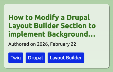
}1 font-size is set to 0.85em in this example as the links are wrapped in an h2 for the same reason given above. Please see the homepage of this site on mobile or narrow widths for this is action; there is also an image below of what this looks like. It is used for the card in the content feed.
Since support is good I feel it is useful if you have content that is sometimes longer than the average. In the case of this site, it would be better practice to make the text smaller for the article titles and this is something I will do when I make some theme modifications.
One final thought on truncating text is you should only do it for edge cases as I have pointed out. If every element needs to be truncated then you should think about redesigning the UI.
Thanks for reading, if you would like to learn more about web design and development I write a short newsletter every week. Since up below.
Simon