This article is a follow on from Adding Gradients to text as backgrounds with CSS background-clip. In that article, I show you how to use background-clip and leave it at that.
This article will go deeper into the use of background-clip. I will cover some observations and what could be considered shortcomings of background-clip: text; to add a pretty background to your text. I will provide some work-a-rounds and thoughts on use with samples, read on to explore more.
One of the main things you need to be aware of when working with background-clip: text; is that it works on the background of the element and not the text. What this means is the background is set on the element and if the default display is block, as in the case of h1, then the gradient background will cover 100% width of the element's parent. Let's have a look at what I mean and also how we can fix and or use it for effect.
Working with H1 block elements and span inline elements
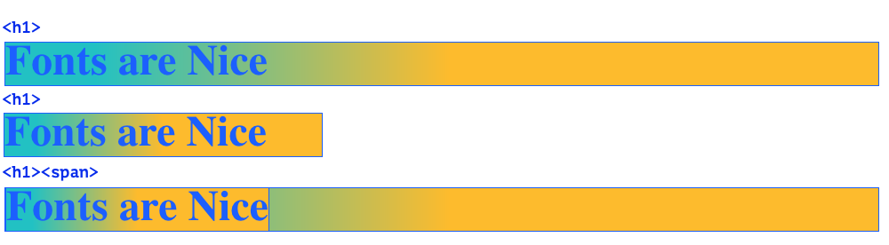
Looking at the image above you can see how the background is set on the H1 and not the text. It shows how the H1 expands to fill the whole full width due to it being a block element. In the second image, you can see how when the screen width is narrow the gradient also adjusts to the width. In the 3rd image, we use a span which is an inline element by default, this means it is contained by the size of the text inside it and therefore the background is also contained.
Now we have an understanding of how the background is applied to text by clipping away everything except the text and making the text transparent, from part 1. And how backgrounds are applied to an element and not the text. Let's have a look at some code examples.
For the following examples, unfortunately, the resize doesn't work on mobile, but you can possibly rotate your device to see the effect.
Long Text Example
I have 3 examples to illustrate this.
Serif Fonts are Nice
Serif Fonts are Nice
Serif Fonts are Nice
The first has the gradient set at exact pixel measurements so no matter the width of the screen the gradient stays consistent.
In the second example, we are using relative units, per cents to be exact, and as you can see the gradient is not obvious at wide screens.
To fix this, in the third example, I have added a span inside the h1 and added the text inside the span. This makes the element that contains the text an inline element, and therefore the background is confined to the size of the text.
If you expand the containing wrapper element you will see that the gradient remains visible in the 3rd example.
Since writing this article, I have learnt we don't actually need to add a span to the
H1. We can add a width to theH1and make the width fit-content. Add the below to you h1 rule.width: fit-content;This only works for heading text that is one line.
Short Text Example
The same is true with short text. You can see how with both the first and second examples the gradient doesn't even show. Only the third example shows the gradient at wide screens. The second example works on narrower screens, but the first example just doesn't work.
Short
Short
Short
With an understanding of how you can now apply the gradients to your text and how the screen width affects the visibility of the background, we will look at a few more examples.
Please note that all these examples have left to right gradients and if you do diagonal gradients or top to bottom gradients the effects will change.
Have a deeper look a CSS text gradients; Highlighting Important words
A nice effect you have probably seen is emphasizing the important words in a headline, this makes it easy for the reader to scan, and if done nicely can also play on words. Let have a look at 2 options for achieving this.
Wrapping emphasized words in span and apply the background to the span
Professional Fonts are Nice for a Unique look.
Doing it this way with multiple highlighted words the gradient is set on the span so you the gradient repeats itself.
In the final example, I will show you how you can add the background so it flows nicely under the text to create a more fluid look.
Adding the background to the H1 and then wrapping the unemphasized text in a span.
Professional Fonts are Nice for a Unique look.
In this example, I use a little reverse trick by adding the gradient to the H1. Then for words that don't need a gradient, I wrap them in a span and set the span colour back to the document colour. You could also make the span whatever colour you like.
Summary
In part 1, we looked at using background-clip on the text and how it works under the hood.
In this deep dive, we looked at how the background is added. We look at the display property, namely block and inline, and how that affects elements. To wrap it up I looked at how you can use a combination of block elements and inline elements to create some nice heading effects.
I hope you learnt something here and if you want to follow along and learn more, be sure to sign up for the newsletter. What's in the newsletter? Tips and tricks, insight into modern tech, and the intersection of design and front-end web development.
Thanks for reading and see you on the inside.