This is written as I am working on redesigning this site and a few other sites so as with most articles on this site it is a living document. The title of this article is somewhat tongue in cheek as you will find out, but TLDR: design and development are always the next steps. Another note I will add, this site has gone from dribs and drabs of traffic to getting its first 50+ almost 200 visitors a day as I publish this, that's fully organic traffic may I add, but illustrates that getting online first is important and then going back to the next step after.
Build to Design
With the site development and core technology set in stone, performance, accessibility best practices, and SEO taken care of (for now), it is now time to iterate on the design.
First though, a bit of a back-story.
Eighteen months ago in a past far far away, I started fresh and I had absolutely no content1. I had lots of experience but no proof of that experience and so I started to write and publish. I wanted to put my content on my domain, that's all I knew. So I made a simple theme for Drupal 8, started to write, and did a soft launch. I have written about doing a soft launch and why I did a soft launch, so I won't go into detail here. However, now that I have a lot of content and related content in the works it is time to put this mess in order. Time to do a "redesign".
If you are starting I recommend you do the same. Get your business, your ideas, and your content online. This not only allows you to improve your skills, but it also allows you to start collecting valuable data and also build a voice and work out a direction.
1I had an old unloved site and a lot of archived work but nothing current. I even wrote a piece of content for SitePoint in 2010 that I still think rings true and is where I will continue. Is this full circle or just getting back on the train of life? I think that's a discussion for another day so let's continue with the redesign.
In this article, I am going to go through a high-level process for design. I will break it into the main sections of discovery, designing, and building. In the future, I will expand on the ideas as I form my processes more. For now, though, I will add links to resources that I enjoyed and that helped me get thus far. So with that out of the way, let us get going!
Time to do a "redesign"
I say "redesign" as I don't use this word. Redesigns are a thing of the past, aren't they? What I am going to do is to improve what I have, I am going to:
- Tweak the user interface, the type, elements, and colour, and possibly add some micro-interactions; tweak the finer detail.
- Add some modules or blocks to guide readers to related or most-read content.
- Add some new ways to classify the content to facilitate the former.
- I am going to review and improve the way the content, mainly the article type, is presented.
- Adjust sizing for mobile and HD, mainly font scales but overall design scale will be looked at.
- I am going to add some advertising to monetize.
Okay, what I am doing is a redesign, I said it!
I want to say that you may do a redesign for a part of your web presence, do a re-brand or freshen up the look. Alternatively, you may keep the look & brand and redesign the data structure to improve the presentation or enable easier syndication of your content. What I am saying is it is doubtful you need to fully redo your web presence all at once.
For now, I am going to do this using Drupal 9 as I know Drupal, yes between starting this endeavour I have upgraded my site from Drupal 8 to 9. However, the process I will use is system agnostic so you could take what I write here and use it with any system. If you haven't read A Story of a soft launch, I suggest you do as you will see how this is a planned "redesign".
A Fraction in time of an Ongoing Process
Over the next few months, I will design this site to include the host of new features mentioned. Notice how I say over time I will do this. I may have one large push of improvements but in reality, it will be an ongoing process as it already has been. I hope I can sit back for a few months in the end but I also feel I will want to tweak the content as I refine the presentation; possibly splitting it up into smaller, more digestible and re-useable parts. Let's not get too far ahead though!
The design will be based around UI/UX, brand, voice and tone. However, some of these improvements will need back-end modifications to implement, so we will look at these and how they can be implemented using Drupal. I will also look at the features in a broader sense so you can understand the purpose.
Getting Started
Whether you start from scratch or whether you are going to improve a current website the basic flow will be the same.
However, if you start from scratch one of the differences is that you will also need to think about producing the content. If that is the case I would suggest building a basic site so that you can start adding content as I point out in A Story about a Soft Launch.
One of the takeaways from that article is that it is way easier to build a site with and around content. Knowing what you have instead of what you think you may have is a much different thing. So go out and write at least 5 pieces of content and get your website idea or business idea, and your mission clear in your mind first.
So now with a basic site with at least 5 pieces of content, 10 would be better, and with a clearer mission at hand, we will look at what we have by doing a content and UI inventory audit.
Doing a Content and UI Inventory Audit
If you are starting out with only 5 - 10 pages or pieces of content this next part will probably already be done. However, I would recommend reading this part and doing it as you may still unearth some new ideas.
In this section, I will look at what you need to do for content and UI inventory audits. These are two different things, content inventory & UI inventory and we will audit both.
As well as being a look at what you have it is also a time for discovery.
Content audit
This will look at the classification of every article, URL structure, consistency of content, images, summary, social sharing, and SEO. I will have missed something here but you get the idea we are looking at the content and how it is related to the site and site structure as a whole. Hopefully, in doing so you will be able to work out how you can design your site to make it easier to search, find and read for your site visitors. If you have a small site this won't take long.
You may also like: Setting up SEO in Drupal
Even though things such as description tags, Twitter cards, and OG images don't directly affect the site design it is a good time to review these, because well, your online presence goes way past your website. It includes your social and search presence as this is how people find you. That said, when doing the content audit one of the main things that I feel is important is that you group the content so that users can find it easily in more than one way.
Doing a content audit is also a good time to review the writing, review and correct things such as:
- Update outgoing links.
- Do your voice and tone reflect the message and you?
- Is the grammar, and overall readability good?
Please excuse my writing and readability right now as this is part of what I'm working on at present and it is hard.
Doing this periodically will expose opportunities. Keeping a "live" audit document as part of the publishing workflow will keep you aware of whether some parts of your content could be done better. This type of system, if followed will all but eliminate the need for full content audits & redesigns in the future.
How to do content audits and manage your content
If you need an idea of what to do then I suggest looking at my audit document.
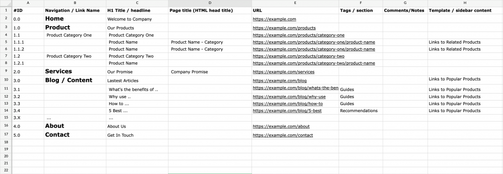
https://docs.zohopublic.com/file/hoa6y560cd44c62954534a633cbb559e5a9c6
You can see that I do this in a spreadsheet and start with the main sections that make up the main navigation. I then list each page and audit all the criteria I feel are important as listed above.
You can also generate a sitemap automatically from your CMS or an online generator and then group it accordingly. Search for XML sitemap generator on a search engine and run it on your site to get started.
Once this is done you will have a better idea of the site content and structure or navigation. You can then make changes to organise the content better. The following video gives a nice overview of what a content audit is. For more details, you can search content audit on a search engine.
Reverse Content Audit™
(Just joking about the trademark.)
If you are just starting out you probably won't need to do a content audit or it won't take that long. That said, I do recommend creating a content generation spreadsheet and documenting newly created content as you do it or as I mentioned, keeping a "live" audit document as part of the publishing workflow. I find as I write I will generate new ideas for new content and where better place to keep it than in a reverse content audit™ document. You can track what images and resources you will need, what the subject is with possible title ideas, what sections it is related to, schedule it and show progress. Then when it comes to auditing it's already done.
If you want to take a deeper look at content audits and also how they relate to structure and design, I would suggest A Book Apart's book Everyday Information Architecture by Lisa Maria Marquis.
Overall, a content audit even though a simple concept can reveal a lot to improve in your site design, from layouts to navigation, and can also shine a light on missing content. Don't miss out on the benefits of doing a full content audit.
UI inventory
The main idea behind a UI inventory audit is to look at all the UI elements such as:
- Titles
- Buttons
- Form elements
- Menus
- Cards
- Images
- Lists like this one
Moving from small elements to the grouping of elements and even as far as layouts.
Since this site is newish, it hasn't gotten that messy but if you are working on an older site you will find that you may have many different versions of the same element, so the idea is to layout it all out so you can see what you have.
In the following image, you can see the UI inventory of a travel site I was involved in. Unfortunately, this site's final design was never realised but by laying out the UI you can see that small inconsistency had crept into the design over the years.
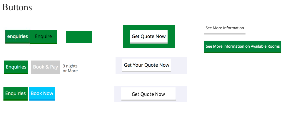
Having these UI elements documented allows for the design to be improved across all elements of the same type. By grouping elements, a design system can be implemented and then followed. As with content audits being kept up to date, having an evolving living design system should eliminate the need for a full redesign but also facilitate the easier refresh of the UI if it needs to be done.
I should note that if you are designing a new site, the same method applies, the difference is you won't need to audit old elements but you will still need to build up a library of elements from buttons, to form inputs, heading, quotes, and so forth.
Doing a UI inventory Audit
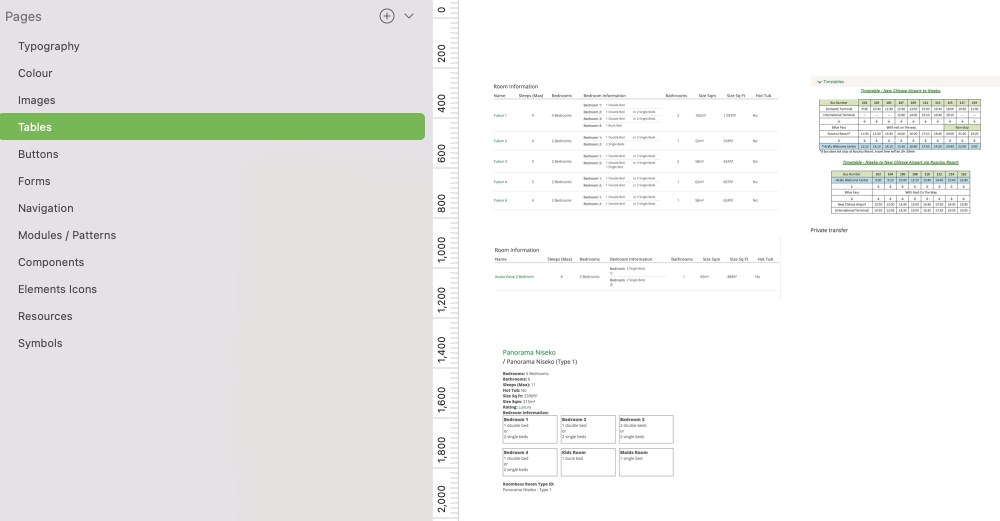
The main idea of a UI is to go over a full site and screen-capturing every element: button, inputs, images with captions, and so forth. Grouping them together and sorting them into single elements and then grouped elements. In the image below you can see my design file and the pages I have going from very focused to more general.
If you want more information on UI audits and for Design systems in general you can chekout Atomic design: UI Inventory and Smashing Magazine. Design systems. Both the resource cover UI audit as part of the overall process of building design systems.
Discovery: The benefit of inventory Audits
Part of doing these audits, I find, gives you a fresh look at what you have and with this, you will almost always come up with new ideas for content and a clearer vision, so doing them regularly as well as keeping them up to date in a cycle will be beneficial not only to your website but to your business as a whole.
That's it for audits and with these, we have a much clearer idea of our site's content, mission, and UI, and are ready for design.
Design
With the audits out of the way, it is time to get onto the aesthetic design of the site. I say aesthetic design as the audits we just did are part of the design process and I don't want to take away from the importance that they have.
Or, maybe I'll put it another way and say that the design process is about everything from audits and brand to performance and this aesthetic design stage is the part that brings these together: It is not the part that creates the former or later but hopefully assists in bringing it all together.
Some of the designs I already have set up from version 1 and since I did this less than 2 years ago I probably won't change it too much. However, I will review it and put my design files and thus systems in order. The idea was to always come back to do what I am doing now so in a way the full design process of the site started over 18 months ago and what I am doing now is part of that ongoing process.
Whether you are starting fresh, doing a redesign, or doing a periodic review, the process and steps will be the same. The process as such will not be linear but irritative. I'm a big fan of design thinking because over the years I have found that until you start, ideas won't crystallize and therefore what you thought was a good font, layout or colour scheme may be just some sort of dream or idea that needs to go in the trash. Harsh I know, but we need to let go of ideas sometimes.
The 5 steps to design
I have five steps and I like to them in the following order as I think that font choice is a major consideration and it will affect the rest of the design. We then move on to the type scale of the typesetting. The font scale will change font choice and will also massively alter the design and the feel of the site. We will look at responsive type as we work on designs for different devices and look at spacing white space and layouts, all the while going back and forward between the first 3 steps. Once we have this set we can evaluate if the feel is right and if so start to think about introducing colour and the finer details such as buttons and icons.
Here are the five steps we will go over in more detail:
- Font choice and pairing.
- Typesetting and type scale.
- Spacing and layout.
- Creating a colour palette.
- Finer detail and features.
Let's take a quick look at the steps and then over time I will take a deeper look at each step and will add my thoughts and more resources.
1 Choosing a Font and Typesetting
Font choice and typesetting are 2 steps but you will probably work on them at the same time while you are still in the deciding phase. Once you have chosen the fonts you will move on to typesetting and then also spacing and layout.
Fonts will affect the whole feel and message of the design massively so be aware of this. I am no font or typesetting master and have a lot to learn in this area but I do know that when I visit a site, the font sets a professional, serious, or fun tone. I can see what message or feeling the site or business is trying to depart. What works for one company and audience won't work for another, you need to be aware of this.
Choosing a font is a fun step, there are so many amazing fonts out there. I will use a free font for a personal website, but if you have a certain font in mind, you may need to pay for it.
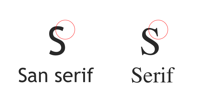
A font can set the feeling of the design. There are many styles of fonts but they generally fall into either serif or sans serif. This is a bit of a generalization but stick with me here.
When we choose a font we will need to first pick a font that is easy to read at 16px and because of this, it will usually be either a serif font or a san serif font. I am using the Ubuntu font on this website, a san serif font with a little bit of character. I like the form of the letters at large sizes but I also feel it is a good font for reading so I went with it for both body text and headings. It is common however to pair fonts so in this step of the design I will look at using a pairing.
Pairing
Pairing is when you choose two fonts. Google fonts used to suggest pairings for you but for some reason have removed this feature. However, there are many resources for doing this which I will cover in a later article. To keep it simple, the idea is to choose a nice font for reading and then pair it with a font for the headings.
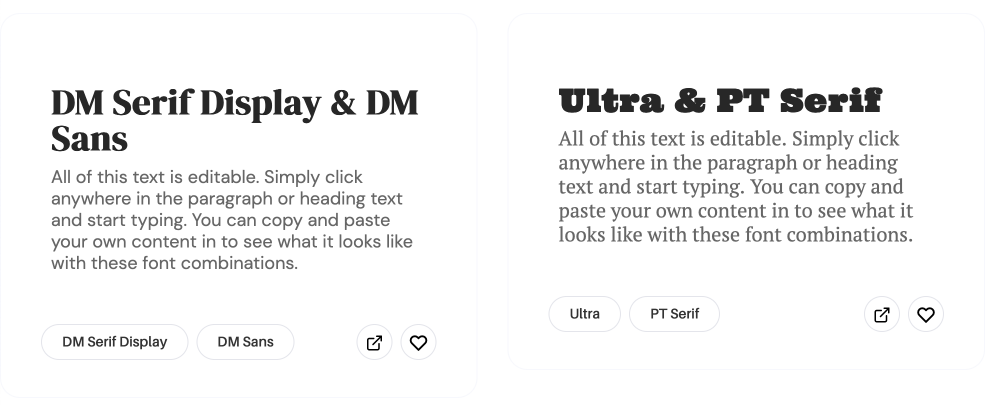
As I said, grouping fonts into serif and sans serif was a bit generalized but for choosing a reading font on the web I feel it is a good idea to keep it to either serif or sans serif. However, when choosing a heading font you can use more decorative font styles such as cursive fonts or slab fonts or dare I say comic fonts. Be careful though when choosing a heading font as you still want it to be readable, even though, headings will generally be bigger and thus easier to read.
Type scale
Type scale serves two purposes for me:
- It makes it easy to keep your design system and therefore the sites look consistent. It helps with the site's elements' size, shape and overall balance.
- It makes using a site easier for a user by giving the content a hierarchy and therefore allows easier scanning of content. This is about the absorption of content by highlighting important content.
Type scale doesn't 100% facilitate both of these but it can go a long way towards it.
These may seem like the same thing and I guess they are but I see them differently because some parts of the site are not part of the main flow. Things such as menus or newsletter sign-up can be in sidebars or footers and therefore need to have adequate sizes or features to bring attention to them. The same can be said about the main content; having a hierarchy that flows and highlights important sections is important for usability and readability.
Type scale will also include line height but until you start to work with blocks of text this won't be so apparent. I will cover this in more detail in the layouts and spacing section.
A quick primer on setting Type Scale
First, you will want to set a base font size. You may find for HD you will want to bump that too. I kind of feel that using 16px is a nice size but then bumping it up to 18px for HD.
Something to take into consideration is that Apple has set 16px as the size for mobile input elements, so to make things look consistent I think using 16px is a good choice. Plus funnily enough, 16px is the default size of all browsers' default user-agent stylesheets so why argue with that?
I say 16px but we should start thinking in a relative unit. This is important for accessibility so that a user can adjust the font size to their preference. You can use the below rule in your master CSS file to set the font size to 100% of the default user agent size and then use rem to set all other text elements as shown in the following image.
Once you have a base font size chosen you can set all the other font elements in a scale. A scale helps with keeping your design looking balanced and consistent by using a ratio that is applied to each sequentially-ascending text element. Have a look at the following illustrations that shows a major second and a major third scale which are 1.125 and 1.25 respectively.
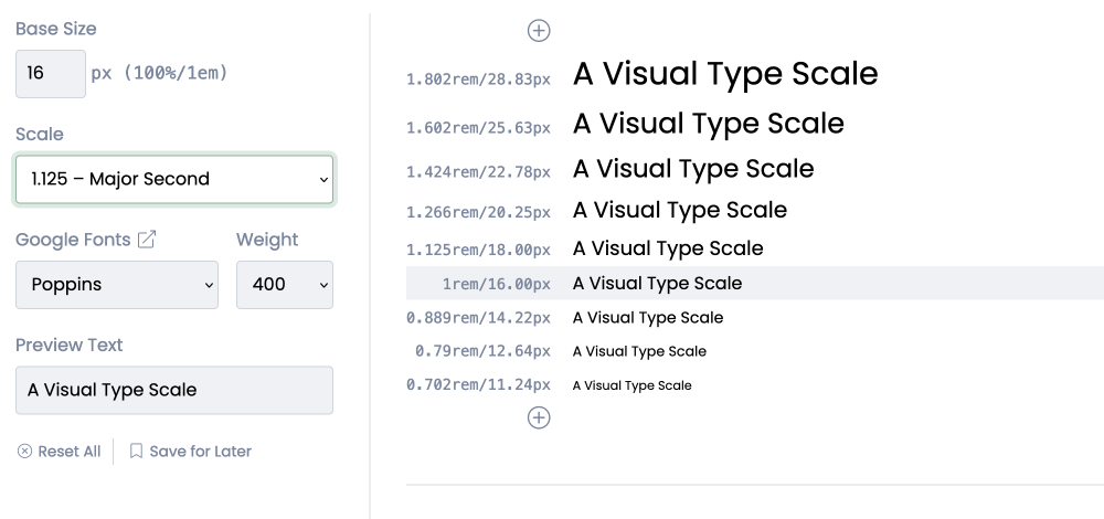
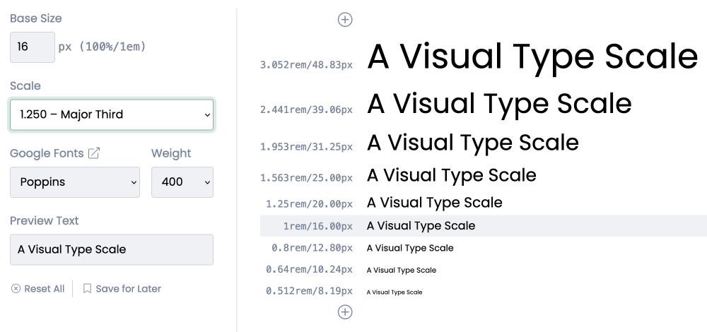
You could also use the Golden ratio if you are looking for something bold.
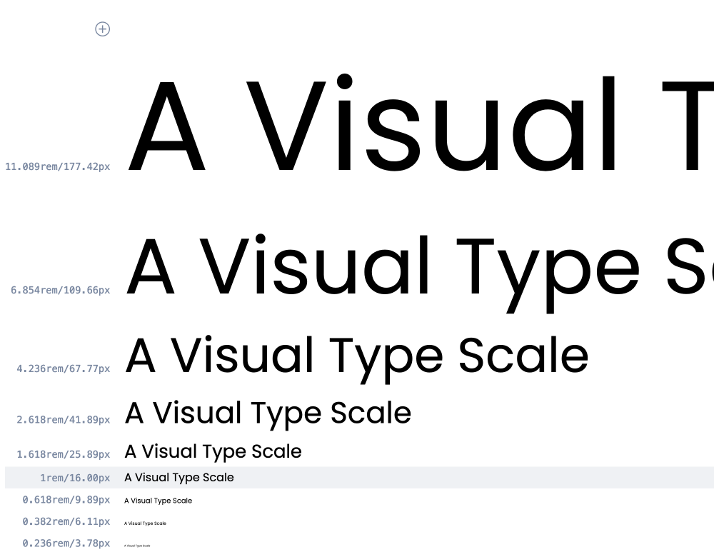
As a general rule, marketing style pages will have a bigger range font scale and news or corporate sites will use a smaller range type scale. This is not a set rule, it is just an observation and you will find sites that go against this observation. One thing is true though, you will personally gravitate to one more and so will everyone. So just remember that you can't please everyone and carve out your niche and go for it.
For more information on typesetting, I enjoyed Tim Brown's book Flexible Typesetting (affiliate link) from the ole' staple of A Book Apart.(A Book Apart no longer sells books, you can purchase form Amazon using the affiliate link).
2 Spacing (and Layouts)
After we have our font and type scale chosen we need to think about spacing.
Line Height
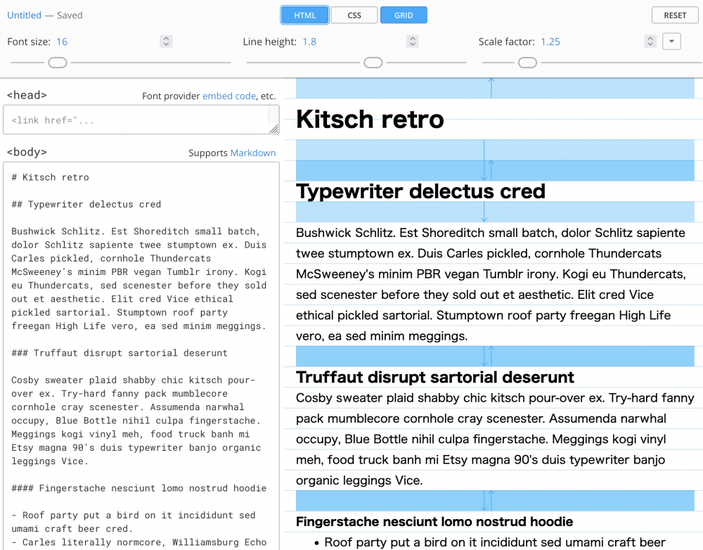
One of the first things we should do is set the line heights on our text. This sets the spacing between the lines of text, not technically the spacing between but a larger line-height and your lines of text will have more white space between them. This is technically typesetting but I have included it in this section to show the connection between type and layout.
Line height is fairly easy to set. A general rule I use is to make the line height larger than the font size and also keep it at a size divisible by 8. So for example, if your heading is 25px then the line height could be 32px, or a font-size of 39px I will use a line-height be 40px or 48px. You will understand the 8 shortly but you can eye it to see what looks right. And make sure you test with headings that wrap onto a second line.
The only other rule you need to remember when setting line height is that paragraph text should have a line height of at least 1.5. This is for accessibility best practices. As with font size, set them using a relative size unit. Line height can be set using no unit as it is a relative measurement but you can also add rem or em if you like.
Block Level Spacing
It is all very well looking at paragraph text and headings and then adding subheadings as we have done with our type scale but the content will be made of many sections; made up of paragraphs and images and other elements such as video, code, galleries, <aside> content and anything else imaginable. To go with the chosen type scale and line height I am going to use the commonly used 8pt grid for the vertical and horizontal spacing.
I want to first mention that what I write in this next section is still experimental for me. I have worked with using layout grids and frameworks but not using a strict 8pt grid, so it is not proven in production or even on the design canvas. I am also guessing the horizontal 8pt grid will be harder to implement due to today's applications needing to have horizontal fluid responsiveness (something I've been working with since I built my first responsive desktop to mobile site in 2014 - then switching the theme at a later stage to mobile-first). However, setting gutters to 8pt multiples, say 48px, and having the columns set as per cent might just work.
I am going to use multiple of 8px for vertical rhythm. I am also going to use rem as a measurement as remember 1rem is 16px. One thing I am unsure about here is what will happen when I bump the base font size to 18px for larger screens on the root.
So you can see this part is un-chart ground for me. I am looking forward to it as I know that having consistent white space and gaps is going to be the thing that will add that unknown quality to the designs. The things you can't see are essential for good design, I know that much. So with that said let's take a quick look at why 8pt.
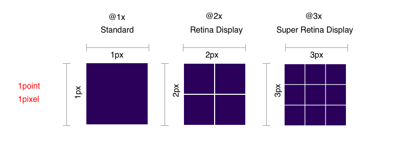
Before looking at the why I will get these two points out of the way as they confused me:
- Don't confuse type pt sizing with device pt sizing; pt for device coordinates and pt for font sizing is different.
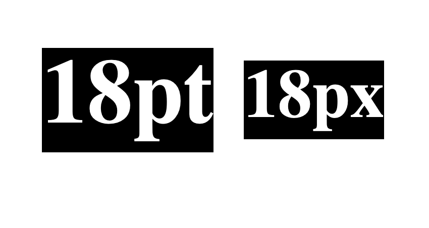
- Is this 8pt or is it 8px?
It is 8pt but it is also 8px. All platforms have a coordinate system based on points, where a @1x display maps 1pt to 1px. For @2x 1pt is 2px.
Okay, now the why.
But why 8pt you ask?
The idea, as with type scale, is to give a feeling of flow, togetherness, and harmony, which makes things easier to read. The 8pt grid gives us a nice rhythm that brings the compositions together, it's a rule that can be set on every element which means we don't need to think about it.
8pt scales nicely to all screen resolutions, meaning that all the hard work you put into making your design look nice on your desktop standard resolution @1x monitor scales perfectly to all screen resolutions.
Have a look at the image below. See how when using an 8pt scale we get nice multiples and whole numbers, but when working with other sizes, in this case 5pt, we need to start working with decimals.
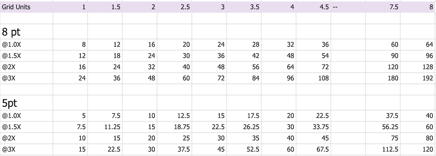
The main reason for using 8pt is it multiples and divides nicely.
Where this becomes even more obvious is when placing and sizing images and image elements such as icons that need to fit into the design but also need to be made into high-resolution assets for high-resolution screens. Text and spacing properties such as margins and padding all adjust using CSS but images and image elements need to be provided at @2x and @3x sizes for high-resolution screens.
I will be working with this in my designs so I will write about it in more detail as I get more familiar with it. I will try and be fully objective in using it to see if there is a definite benefit to working with such a strict grid. My initial thought is it will make things easier and also will make things seem more harmonise.
The idea seems solid so I'm going to embrace it without too many questions; who doesn't like a consistent look? As with most things, you won't really understand the pros and cons until you start to work with them.
I haven't gone into a lot of detail here but if you are interested you can read The Comprehensive 8pt Grid guide. This guide I feel is still relevant even though it was written in 2019 and is a good starting point for your exploration.
For your layouts
I have already mentioned this but horizontally I will use the 8pt for my column gaps or channels. Also with the columns I will place items on 8pt grid lines, these will then convert to CSS units. I will also look at this is more details as I redesign my site but I have included an image below to show you how you can use it for horizontal spacing.
Using ch for Blocks of text
This is somewhat random but definitely worth thinking about within the conversation of grids and layouts so I will mention this here. As with most of this article, I will look at this in more depth in another article. However, for text, try and keep paragraphs to around 50 - 70 characters in width, this helps readers with reading by making it easier to return to the next line. You can use the ch CSS unit here.
In setting the text to this unit you need to give it space to grow as 60ch in 16px is going to be different than 60ch at 18px. This is another area I will be exploring in the coming months, using this and other responsive type techniques.
With all this in mind, Let's move on to Layouts now
3 Layouts & Grids
Depending on your site you will want to have different layouts. For this site, I am going to keep it simple since I want to keep the reader's concentration on the article. I am mainly going to go with a one-column layout. However, I will have related content in a 3-column layout across the bottom and there will be a right sidebar that I will use sparingly for related content and advertising. On larger screens, I'm going to experiment with left-side main navigation which is already the case on screens wider than 2500px, check it out. If you are building a media or business-oriented site then you may have 2 or 3 columns being a prominent layout throughout your site. I will cover this in a future article and the idea of wireframing but for now here are some different types of layouts you may want to use.
Device Sizes
Before we move on to colour I will mention that up until now I have been working on the design of what one would consider an average desktop size. But at some stage, we do need to think about mobile sizes. Currently, the site uses the same sizing on mobile but when I initially drew up the design I started to experiment with mobile sizing as illustrated below.
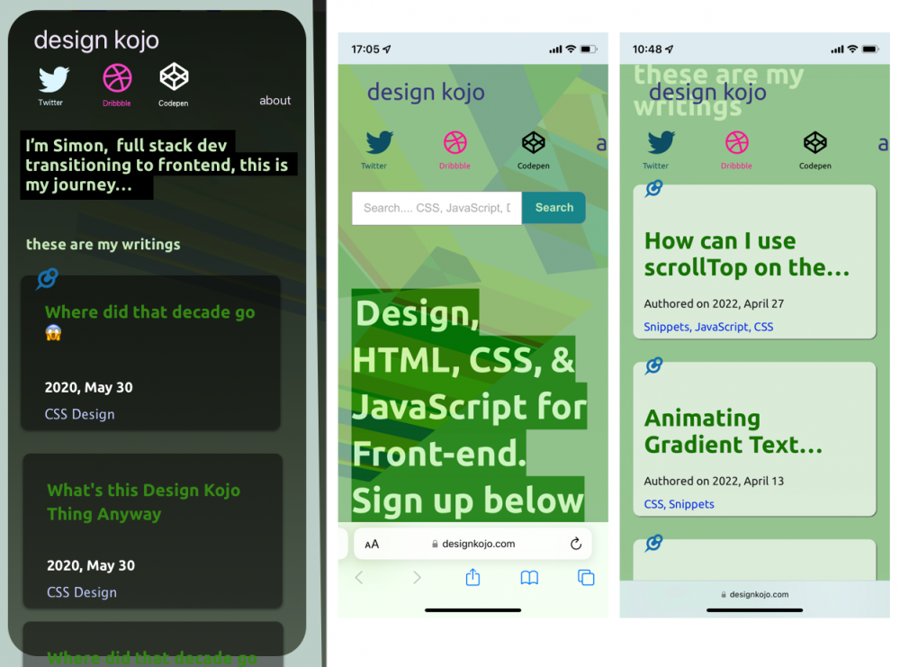
I am liking the small headings now there is content on the site. Note that when I started this project I had 1 article so the larger sizing worked. It is now time to look at implementing this design as we look at the finer detail. I should point out this is subjective.
Finer Detail
Some finer details I have already uncovered, written about and/or implemented are:
- Ellipse on cards is not a great solution. Time to fix that.
- Pin-to-top icon.
- The form font size on mobile.
Other things that I want to look at are nicer and easier-to-understand tags, and dates, and even though all the work is mine I want to add a small author card with each article since it may be difficult for the reader to know exactly who is writing. I feel adding a face or something human to the text is a good idea. I will look at finer details in more depth as I work on the design so we will revisit it as a good design thinker should.
Gestalt Principles
I will mention Gestalt Principles of design but it should be a whole article of its own. The basic idea of the Gestalt principles is that items that a group close together seem like they are of the same element and that adding space around things shows that things are individual items. Colour can be used to group things and or make patterns that show an association. The principle describes how humans perceive things as part of a whole. It's generally accepted there are 7 areas to Gestalt Principles but sometimes they are divided into more. The 7 Gestalt principles of design are listed below.
- Principle of proximity
- Principle of closure
- Principle of similarity
- Principle of continuation
- Principle of figure (the focal point) ground (background)
- Principle of organization (common fate)
- Principle of symmetry
From the above list, you can get an idea of what the principles are. They are useful ideas to keep in mind when placing items on the screen and by using scales and grids you can quickly make something look whole but also help a user to understand the connection between elements. I will write about this more as it is good to grasp and use them when designing websites. However, for now, let's move on.
In this section, we looked at font and type scales, grids, and psychological theory. More generally we looked at overall consistency in design, size, and balance. Let's now look at colour.
The wabi-sabi designer
Consistency of design is important but inconsistency can also be used to its advantage. Slightly and purposely inconsistent can make it not showy and make people feel welcome. Sometimes these small inconsitent features might just happen, so go with them. Then again if you are trying to sell high-end products it will help by having a pixel-perfect design; it depends on the product. I guess the main takeaway from what I am saying is to make sure that your design is suitable for the market and a purposely thought out look will help. Be it polished ot sligthly quirky.
4 Colour and Colour Palettes
Colour is a major part of design for me. However, in recent times I see the former, namely font and type scale needing to be dealt with first. Maybe that's because it's newer to me so I need to spend more time on it. I wrote about colour and photography back in 2010 as already mentioned and I still feel that article rings true as nature seems to have this amazing ability to get colour palettes just right. In that article, I talked about how I used colour in photographs to influence the colour palette; since colour is important, it could become before type choice and typesetting. I'll leave that up to you to decide. Design is an iterative process.
Up until now, we haven't talked about colour but you may already have colour as part of the brand or business you are working with or if you are working on your project you may already have a colour in mind. You may have already been experimenting with colours as you worked on the fonts and types scales. If you have been then kudos to you.
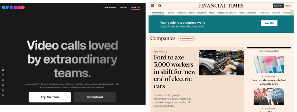
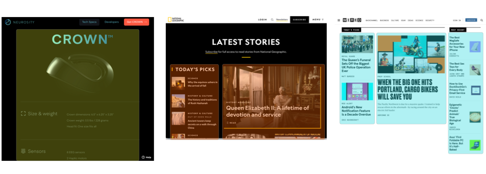
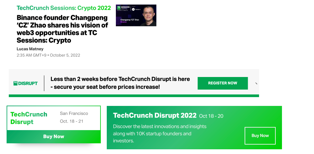
So let's say you have your colours. In my case, I am using green and purple as these have been my colours for as long as I remember. With these, we need to make a colour palette. We possibly want to have a contrasting colour or if not contrasting will want a more saturated colour for buttons and CTA. In the case of this site green is the main colour and I have used purple sparingly for the header text (for now). I have gone for the green button which is a more saturated green and also of a different hue for the call to action. I chose these colours organically because they felt right. In some cases you may only want to have one colour, a good example of this is one of my favourite designed sites and that is TechCrunch. You can see in the following image that their colour is green and they keep all accent and CTA elements to the green hue.
If you are not trying to sell or get someone to do something with a call to action, and this may be the case, then you may not need to think about colour in this way. However, with the majority of sites and businesses you probably do as without sales or leads and money coming in we have no business. I will write about this in more detail in a future article but by keeping this in mind, and using colour to bring attention to things you will keep people on your site and be able to guide them to other content you feel may be of interest to them.
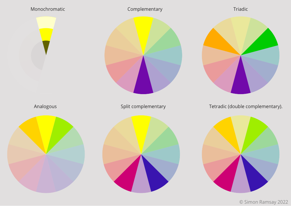
There are six classic colour schemes. They are monochromatic, analogous, complementary, split complementary, triadic, and tetradic (double complementary). You will have reasons for using each. Below you can see the differences in the colour schemes.
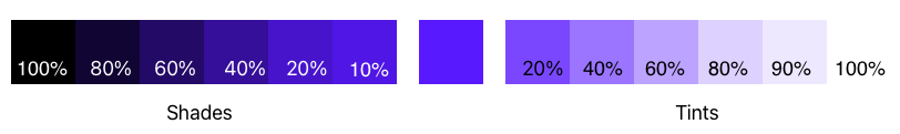
You also have tones and shades where you can either make more saturated or pastel colour palettes to give slight emphasis or de-emphasis to some elements but keep to the same colour hue. This is similar to a monochromatic colour scheme in a way. I find it nice to have these to use on the background of elements, to use on text blocks, or on the borders of elements.
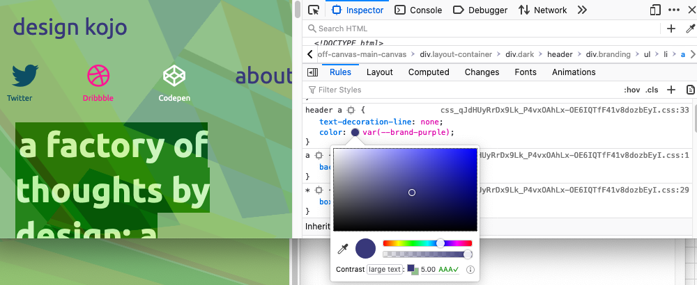
Another aspect of colour you need to think about is colour contrast as you want your site to be as accessible as possible, so always check the colour choices to see that they satisfy the colour contrast ratios. You can read more about the importance of colour contrast in my What is colour contrast article. In that article, you can also read about the tools you can use while you design and also browser tools to check sites that are already online as illustrated in the image below.
This section has been kept short. I will cover colour in more detail at some later stage as it is a fun topic and can make or create a design.
Have a play around with a few of the tools below and experiment, go with what feels right to you but keep in mind the colour schemes as fullbacks. If you want to have a contrasting colour, use one from the opposite side of the colour wheel as it is proven that this is pleasing to the human eye. Other than that, try and break the rules as you never know you may come up with something that works perfectly for your particular case.
Paletton uses an RYB colour wheel and you can explore the colour scheme at a click of a button.
Adobe Colour wheel has 5 swatches in each colour scheme it generates and its harmony rules seem to be slightly adjusted from pure schemes.
Sessions College Color Calculator has both RYB & RGB colour modes and simple colour harmony buttons.
Colors allow you explore the colour harmonies from an entered hex colour code.
I guess for now the thing I want to emphasise is to choose a colour scheme and then use one of the main colours to build out shades and tints to use to bring your design together.
5 Finer Detail
Design the Separate elements and icons
When I designed this site over 18 months ago I stopped at this step as there was no content and therefore the finer detail and elements were not present. However, now with a UI inventory audit, we can see that things such as pagination, tags, and tag section pages all need a little work.
As you are probably thinking to yourself, you have already covered this earlier, and you would be right. I want to cover it again as what I talked about was smaller detail I had already identified and implemented and design is an iterative process. Let's take a look at a few areas I will explore.
Content presentation
In the articles, I want to add different ways to add the aside content. Currently, all aside content is blue with a blue border. I want to differentiate between thought pieces, warnings, and important.
I want to add the type of code in the code snippets (this may need thinking about), make the image captions a little unique and do something with the comments.
I also would like to add some image styles where you can float images left and right. Even though this site is heavily based on tech and lessons, I will also be adding more on life and other interests, so having a different way to present images in content is important. Also, it will be a great lesson in content layout and the work I do here is my portfolio of sorts.
The code is particularly important so I also want to look at changing the style and also make sure that it can be shared or exposed via an API so it can be used on other sites. This is part of design you may not think about but it is where technology and design meet.
There will be lots of other small things to do with the display of content and I will probably also look at different ways of adding the content to the site, such as Drupal paragraphs and layout builder to Gutenberg and other simpler methods.
Content presentation and syndication are important, so I will spend a bit of time exploring them too.
As well as adding finer details to the content of the current site, I want to add some new features. Below is some of what I will be adding but this will change as I work with the site.
New features and elements to improve content discovery
Adding features to keep people on your site by presenting them with something related, some most read content, or the latest article. I.e. You may also like, Most popular or related content.
Also, I'd like to add a better newsletter sign-up CTA, something I can add mid-article, in the sidebar, or something that appears on the scroll but not a pop-up.
Minor Tweaks
Small tweaks to make it easier for people to use the site and also fix accessibility issues.
- Navigation background on scroll.
- Mobile sizing - As mentioned, when starting it's nice to have big headings as you don't have a lot of content but as you build out your site maybe there is a better use of the screen.
- I also like the idea of micro-interactions as they add fun details to an otherwise static UI. Maybe for this site, they are not needed but I will look at them for the other sites.
- Fix hard-to-read icons, The Codepen white logo is not very accessible, sorry about that. ✅
- Fixed header offset for systems messages. ✅
Micro interaction
If you are wondering what types of micro animations I am talking about, here is a small list.
- Animations on scroll.
- Parallax images.
- Button click confirmation.
Some final additions I might add
- Add logos and support badges to show trust and support.
- Reading time.
- Testimonials
Wow, that's quite a list you say and you would be right again. But this is what will make your designs shine, these small details are what set a plain-looking site apart from a more refined design. Go look at some of your favourite sites and find these details and then imagine the site without them. You will see this is the secret sauce. I wrote about this on my old site way back in the old days, the day before Bitcoin, Instagram, and TikTok, oh how those were the days. If you are interested in my thoughts you can read about Mori no Uta Hotel and the finer detail of the design that makes the place special.
Well, that's about on finer details for this article but this will be revisited again as this and other sites I am building are worked on. It is now time to get the design comps in order and start the build.
Build: Best Practices, Accessibility, Performance and SEO checks
We have already done the audits so when we are on the building stage we can look at including what is missing. All I want to mention here is that when starting out that you include the most basic SEO and then over time go back and add more depending on the purpose of your content. Do you want your content to be searchable? Do you want to add reviews or authority? Is it accessible to the biggest audience? All these sorts of things can be seen as modern-day search engine optimizations and should be included in the build by default. Sometimes they are not and that's okay as we can check again and make improvements.
Conclusion
In this article, we have looked at the general overview of how you can design a site or even a book for that matter. We have learnt about how we can use a few rules to bring your design together.
As stated at the beginning, this is a high-level overview and you should go back and forth between steps. I will write more about all the areas covered in this article in the coming months as I work on building sites so you can see my thoughts and why I have chosen a certain feature over another. The thing to keep in mind is even though design is very subjective there are rules and systems you can use to help.
So that's it for this design critique, time to plan implementation and to think forward because as the content of your site grows you will probably want to reuse it. If you enjoyed this, be sure to sign up for the newsletter to get more tech and design insights using the form below.