This article use Classy theme to add classes to the Drupal markup. Even though you can still use Classy theme in Drupal 10 by using the Classy contributed theme it is now suggested to use the Starterkit theme to get the same markup. Since Startertkit is a fork of Classy, where I talk about Classy you can also read this as Starterkit. I will be updating this article to reflect the changes in the coming months.
In Part 1, Drupal Theme Primer Part 1: Creating a Drupal Sub-theme, we learnt how to make a child theme or more correctly in Drupal lingo a sub-theme and we also looked at the minimum needed to create a unique look to the Olivero theme. As I also pointed out we have a lot of options available to create and place content on our Drupal site without needing to modify the theme.
In this second part, we will take what we learnt from part 1 and modify it to start with a blank canvas. We will look at the raw output of a vanilla Drupal site, the stable theme and then look at classy theme which adds BEM style classes to the element. While looking at both Stable and Classy we will also look at:
- What markup is provided?
- The regions that come with these themes
- The order in which they are rendered to the screen.
All this will be done without creating any template files. We will look at template files in part 3 when we looking at adding and naming our own regions.
As you will see later we will add the regions to our info file as theme regions aren't inherited from the sub-theme and as such come directly from the Drupal default regions. I won't go into great detail here as it is an advanced topic. However, all you need to know is if you don't add the regions to the info file, on the block layout page they will appear in somewhat random order. More on this later.
Setting Stable as a Base Theme
Stable is the raw output of Drupal unless you decide to write your own theme. Stable is hidden in the UI as the intention of it is to be used as a base theme.
To use Stable all we need to do is grab our theme from part 1 and change the base theme property in the info YAML file. Might as well change the description while we are at it.
name: Kodomo 2.0
type: theme
-base theme: olivero
+base theme: stable
-description: 'Kodomo; minor overrides to Olivero, a clean, accessible, and flexible Drupal front-end theme.'
+description: 'Kodomo; A simple theme based off Drupal core Stable theme.'
alt text: 'Screenshot of Kodomo 2.0, Drupal front-end theme.'
If you now upload the theme info file you will see all the great functionality and styling of Olivero has gone, but our modified CSS is still in tacked. Not looking that great either with that green background! Time to remove our custom styles and start from scratch.
In Drupal 9 we have the option to use Stable 9, but if you go with Classy as we will look at in the next section of this article you will be using Stable.
The Output in HTML 5
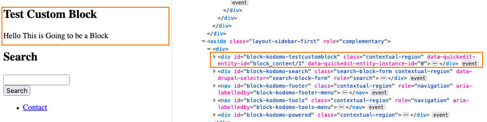
Okay, we have removed the styles so we have a very basic page generated. As illustrated below it has no styles at all. However, if you look closer you will see that everything rendered to the screen is nicely wrapped in markup and the nice thing about the markup is it is HTML5. This is a good start.
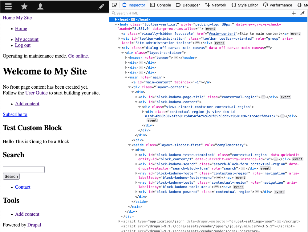
The markup also has some very basic classes added up and over of the semantic HTML 5 elements. Below is an example of what you get and you can see it for yourself by using the inspector in the browsers developer tools.
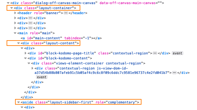
We will look at the templates in the next part, part 3, in more detail but if you're keen you can see what is outputting the above markup by looking at the core/themes/stable folder. As stated in the readme.txt, Stable provides a copy of all the core twig template files so that it can remain backwards compatible. The sample code below shows you how the templates are written to output the markup with the regions output in the Twig moustache syntax.
<div class="layout-container">

  <header role="banner">
    {{ page.header }}
  </header>

  {{ page.primary_menu }}
  {{ page.secondary_menu }}

  {{ page.breadcrumb }}

  {{ page.highlighted }}

  {{ page.help }}

  <main role="main">
    <a id="main-content" tabindex="-1"></a>{# link is in html.html.twig #}

    <div class="layout-content">
      {{ page.content }}
    </div>{# /.layout-content #}
As you can see the markup is sufficient and so are the classes if you are keeping things simple. For more classes, we need to step it up and use the Classy theme as a base.
Enter Classy Theme
To use the Classy theme all we need to do is set base theme: classy in the theme info.
Classy is built on Stable with the only difference being the classes that are added to the elements. Let's take a quick look at what classes are added by doing a side-by-side of the markup.
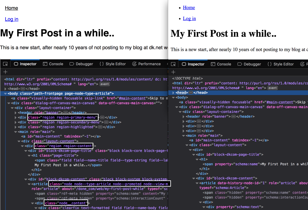
If you look at the core/theme/classy/classy.info.yml you will see base theme: stable is set. In fact Classy is the only theme provided by core that has a base theme set, all other themes are built directly from core files.
Related: How Drupal Classy Theme adds classes to the markup: a mini deep-dive into Twig. (coming soon)
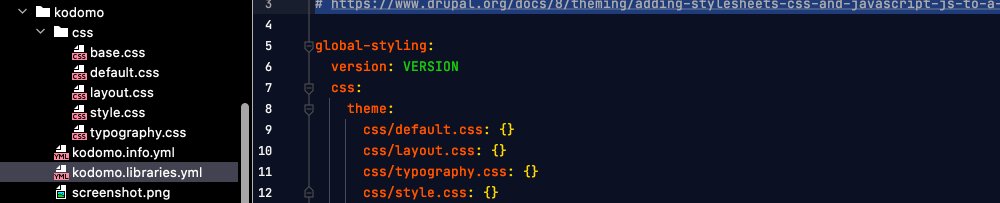
Now that we know what markup we have to work with we can write a few styles to modify the layout. Since this article series is more about how to use the Drupal theme layer we won't go into too much detail about the actual CSS but instead, just add a few CSS files. I like to add typography, layout and style sheets. I am adding a font, a type scale and a few other font related rules to the typography sheet. In the layout, we will have a breakpoint and a few rules to help display the main layout elements and make sure the menus and a few other elements are laid out correctly. In style, I'll add a dark mode theme using prefered-color-scheme and style things such as inputs. All in all only about 200 lines of CSS and a good basis for your own theme. Below is what our theme file and directory now looks like.
Drupal Performance & Aggregation
Drupal CSS aggregation will aggregated the CSS in the order you add it to the libraries so the last sheet will override every else. This is a great out of the box feature in Drupal and can be found on the Performacne page in the admin.
admin/config/development/performance
Well, that's about it for this step. I think it is worth mentioning that we are not using Drupal responsive images and breakpoints as those are advanced topics but I will look at them in another article very shortly. Be sure to sign up for the newsletter if you haven't already and you're keen on tech and design. I write about Drupal, Vue.js, and other front-end technologies and will be doing the odd giveaway.
Thanks for reading and see you soon.
Related: Drupal Theme Primer Part 3: Adding Regions and Templates to Custom Themes