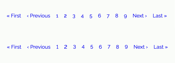
Why do my numbers not align evenly on the baseline?
Fonts can make or break a design, they have so much information in them from shape, size, style, and also features that sometimes need to be adjusted for. In this article I am going to look at just one feature or what I've since learnt is called a variant. This variant is old style and lining numerals and hopefully by exploring it will open up the whole world of fonts to you. Let's go.
Numbers, old style and lining numerals, what, you say?
The other month I was working on a site and was given the job of building the pagination. It was a fun job as it had icons for first and last and next and previous and the states for active and not active and also the current page. It came together fairly quickly as the markup had all the classes needed but then the numbers seemed all wobbly or out of place. For the component, they just didn't look right.
The first thought I had was that I would have to suggest a new font for the pagination but then through my limited knowledge of fonts and type setting, I thought this must be a built-in feature and there must also be a way to override this. And true to my thought and a bit of a search, sorry I don't know what I searched, there is a way to fix this in your CSS rules. And the magical property and value is font-feature-settings: "lnum";

Okay, even though at first search that is what I found and it does work, after reading a little more on the subject I found that there is a higher level replacement property and when there is such a property it should be used. In this case, there is a font-variant-numeric property and value you can use. It is font-variant-numeric: lining-nums; hmm, that's better lining-nums makes more sense than lnum. Good.
font-variant- or font-feature-settings
From what I have read, and possibly an overly simplified explanation, font-variant-(properties) are part of the font family and font-feature-settings are for use with OpenType fonts to control typographic features. Do OpenType fonts allow for features to be applied not built-in? is my first question when I read this and it is a good question. I will explore this more in the future and link to more detail on these properties once done, stay posted.
Can I use these font-variant- or font-feature-settings?
Can I use? yes you can use font-variant-numeric, at present, there is 96% coverage with the usual browsers not playing ball. Interestingly, font-feature-settings has 97.5% with a -moz- and -webkit- prefixes to support mainly older browsers.
How do I know if my font includes a variant or feature?
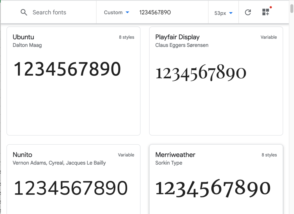
I guess the easiest way is to type out the numbers or glyphs that you are interested in and look. This can easily be done on Google fonts.

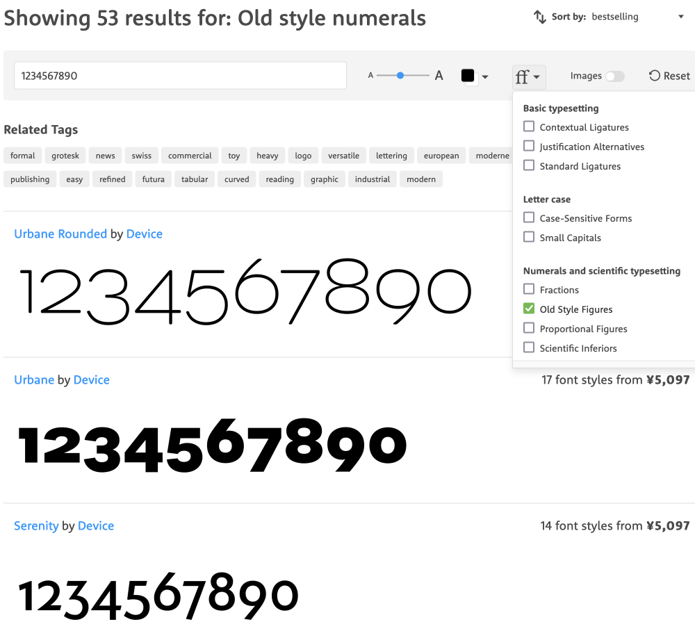
However, if you are searching for a font that you are happy to pay for it is possible that you'll be able to filter fonts to your criteria. This is possible on myfonts.com and I suggest you go have a look and search by old style numbers. Be sure to try variations on that however as it's not perfect.

Don't get me wrong here, I am not suggesting that you set this property to lining-nums or lnum on the global font rule, only set it when the numbers may need it as in the case of the pagination. This will be a somewhat subjective opinion but also wobbly numbers are difficult to look at in a pagination component.
Conclusion
This little exploration made me really admire the font designers and their art form, and has opened up exploration into all the other features that I was unaware of. Now I have this feature or variant and also many others I can use in my work. I really like the old numbers style and in most situations, they look great.
I hope this article on this one little feature of fonts inspires you to dive deeper into the fonts and typesetting in your own design and development work. And on that note, thanks for reading and if you are a developer looking to expand your knowledge of design and development or a designer that wants to learn about development, be sure to sign up for my newsletter where I write about just that. Until next time my friends, hustle less, dream more, and seize the day!