This article is part of a series I am writing on how to make a modern basic HTML page. If you are interested in getting first access to such content then be sure to sign up for the newsletter.
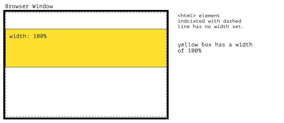
There are 2 ways to make an element stretch 100% of the view width that I know of. And there are possibly multiple more. One way is to make sure the element doesn't have any constraining wrapper and then add a CSS rule to make the element 100% as illustrated below.
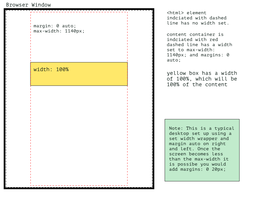
However, this isn't always possible, especially if you are using a grid framework as this will usually require a wrapper as shown below.
This is even more true if you are using dynamically generated templates as part of a CMS or framework and only want to add the rule to the odd image, quoted text, or code snippet within an article. In this situation, the chances are you not only have a constraining grid wrapper but also a wrapper that is wrapping the article content or various other div wrappers.
So how do you deal with this scenario? Read on to find out.
In this article, I am going to show you how you can make an element 100% of the viewport width where you have to deal with dynamically generated templates and can't modify the output due to needing to rewrite too much code. The technique requires you to add a wrapper and or a class to the element or section you want to stretch to 100% view width and use a bit of CSS. You can also use pseudo-classes if you are a CSS master.
Okay, let's take a quick look at an example.
Prepare the HTML
Preparing the HTML is really simple. It is as easy as adding a class to an HTML tag that is wrapping what you want to expand to 100% of the view width. You may need to also add a wrapper if you can't use one that already exists. For those of you who are CSS wizards and ninjas, you could also use a pseudo-class.
Now that we have the element selected we can add the CSS rule in the next step
The magic CSS to make your element break all boundaries and do what seems impossible
Using our selector, which in this case is a div with a class of one-hundred-vw, we can make the element 100vw with the 4 properties outlined below:
.one-hundred-vw {
  width: 100vw;
  position: relative;
  max-width: 100vw;
  left: 50%;
  margin-left: -50vw;
}- The first thing we will need to do is add the position property to the rule and make it relative. Make sure you use relative here as other position values won't work.
Related: CSS Positioning using the Position Property
- Add the max-width 100vw property-value pair. Without this, this technique doesn't work.
- Then push the element to the left using the left property, this effectively overrides any positioning and as you will see it is now half off the right side of the page.
- Add a negative margin of 50vw to now offset the position.
That's it, the rest is purely styling preferences.
Giving the element some space inside and out
Giving the element some space above and below makes sure the elements before and after don't touch it. Then add padding to move the content or element(s) inside away from the edge.
Both of these property values may be set at a global level rule if you have a design system in place, but just in case you haven't it is worth mentioning.
The content inside
To place element(s) inside you could add a display property and position them like that. For example, you could add display: flex with justify-content: space around instead of padding or any number of other layout techniques. The idea again is to give a little white space and make sure the content isn't touching the edges, unless, of course, the design is to have the content touch the edges, such as a full-width background image.
Well, I hope this is helpful to see how you can apply multiple rules to an element to achieve a nice effect to make the background of a section cover 100% of the page width or 100vw. Have a play around, see what happens if you make it 90% and then move it right and add a right margin. That's what I do here, experiment to see what happens.
Thanks for dropping by the design kojo dojo and be sure to sign up for the newsletter so you get some HTML and CSS goodness to your inbox.
Till next time my friends, sayonara, adious, kia ora.