This artilce is a work in progress, a living document and needs to be reviewed. I have published it because I feel it makes some valid points.
The article is based on work from the last few years of building themes from the ground up while making them accessible. What I write about here is the basic starting point for dealing with heading hierachy in HTML. In future articles, I will be looking at how to semantically layout content using correct markup so that no only will your headings be in correct order but your content also will be marked up to indicate its importance to the page. That said what I write here I feel is the foundation to build off and if you do at least this your documents will pass automated accessibility evaluation tools for using headings correctly.
This article is going to look at headings in HTML. We will first look at what they are, then take a look at how they should be used in general, and then see how this aligns with accessibility best practices. Then we will look at how we can include them in our design and development process, which sometimes isn't as easy as one might think. Let's get stuck in.
So headings, what are headings in HTML?
If you are familiar with HTML, this is an easy one. Headings are the h tags, they are usually set up in your typesetting in CSS. There are 6 levels you can use but I'd say most sites only really need 4 or 5. They are h1, h2, h3, h4, h5, and h6. They are wrapped around content that is funnily enough headings! You do that like this: <h1>My Funny or Curious Article Heading</h1>. But you know that.
How should headings be used?
When writing, headings can be used to storyboard or outline an article. Use them as the points you will cover. They won't always be your headings and you may add more headings and subheadings as you work. The main thing here is you can use them to break the article down into sections and the sections should have a logical flow. If some idea is one of the main concepts, then its heading should have the same weight as the other main concepts. If something is a sub-thread of one of the main ideas, then you could use a lower heading to indicate this. Generally, not only will the headings have a visual difference in your favourite word processor, but when they are moved into HTML this visual hierarchy will be given a semantic meaning too.
This is where the idea of a visual hierarchy and then semantic hierarchy sometimes gets messed up. I mean you use a smaller heading because you feel the larger heading is too big or you use a larger heading because you want to highlight something. I have done this too. The point I make is it will happen. But if possible, we should avoid it as the headings should inform some semantic meaning so people with eyesight impairments can get the intended importance as they can't see the visual indication.
How does this fit into accessibility and recommendations?
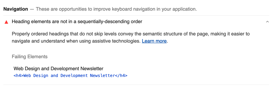
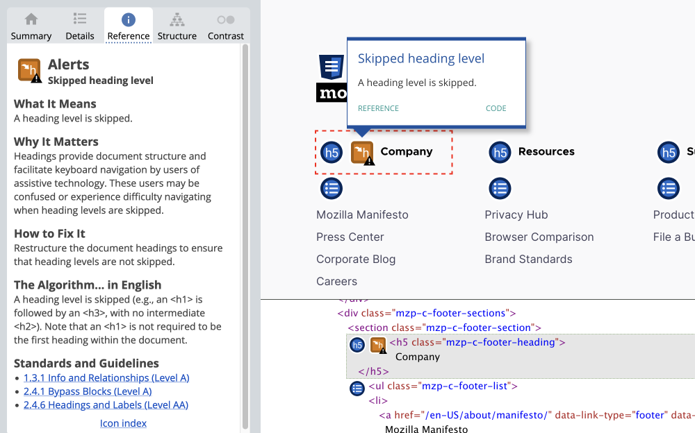
When doing an accessibility audit for your site, one of the things you will come across is "heading being out of sequentially descending order" or "A heading level is skipped" as shown in the images below from Lighthouse and Wave.
What does it mean by out of sequentially-descending order?
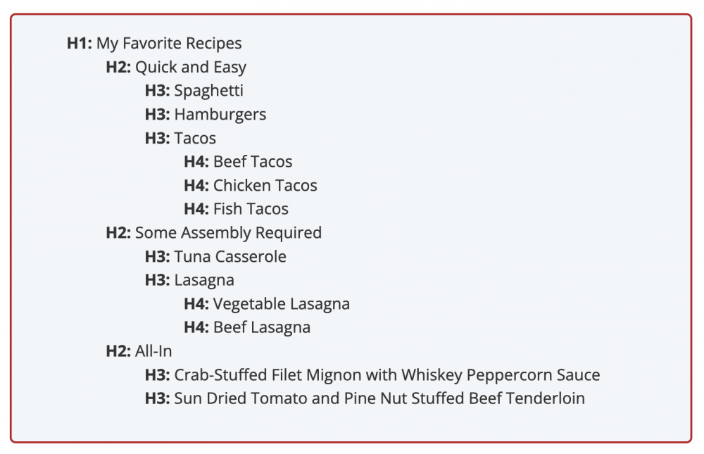
Headings, that is h1 - h6 elements, are used to show the importance and organisation of content on the page. They should form an outline of the information as described on the Semantic Structure: Regions, Headings, and List page of the WebAIM site.
As discussed above, headings should follow a logical order when writing and this is true not just visually but semantically. So you can see that there is a connection here no matter which way you look at it. I would go as far as to say that the accessibility rule came from the idea that headings should indicate sections and subsections and not the other way around. The idea has been around for as long as people have been writing.
For those that do write this seems logical. However, when choosing headings in the WYSIWYG of your CMS the headings might not correspond to what you think they should, causing you to use a heading that is not semantically correct. This is why it is important that headings are designed so that the users or writers can see the visual hierarchy, and two, that the implementation is also correct.
So how do we do this?
The easiest way to achieve this is through the correct usage of headings when you write and using semantic HTML h1 - h6 to identify headings. You can do this when you start to plan your articles and as you write. Then use these 2 basic rules as a content creator, content manager, editor, designer or developer:
- Don't skip a level when content is becoming more detailed.
- To close a subsection and start a new section going from h4 to h2, for example, is fine.
It is also generally accepted that there should only be one h1 on a page (but it's not wrong to have more than one) so I put forward that h2 is now the "most" important heading on the page when it comes to designing.
This is where my rule of "If in doubt, use h2" comes from.
When designing we should use h2 and only use lower heading elements if we know that a heading one level higher will always proceed.
Making headings keep to correct order is difficult
Well if you follow the rule I don't think this is the case, but let's have a quick look at when we can get issues by looking at some situations that I have come across.
Widgets from 3rd parties
In the example shown at the start from Lighthouse, the issue came from using a widget from a 3rd party email sign up form. The email newsletter service provided both a quick code and also the full HTML. Since the quick code can't be modified I had to use the HTML and change the h4 to h2 and that was it. Now I can use the newsletter sign up form anywhere on the site and it won't be out of order. This will technically work anywhere but by adding it to the middle of an article you may also want to add a wrapper to indicate it is aside content or as a section.
Themes bought from theme marketplaces
Just recently I was working with a theme from a marketplace for a client. This theme, as nice as it is, had willy-nilly headings in it which should probably be changed. Just remember though if you are in this situation you would also need to modify the CSS so that when changing a heading from h4 to h2 or h5 to h2 you not only change the semantic meaning to give the order, but you also change the size to keep the original visual meaning. What you need to remember is when you are designing that if you give something a hierarchical visual meaning that it won't always translate best into semantic heading order, i.e. just because visually it makes sense to make a footer or sidebar section heading smaller, it doesn't mean you should make it h4 or h5.
As you might know, I love Drupal. When recently working with the new default theme Olivero I checked out the headings for everything, block, views, and content, and not really to my surprise the design uses h2 for blocks and views, AKA widgets on steroids, which makes me believe what I am saying. Drupal is a big project with lots of smart people. And not only that the project always puts web standards and best practices at the centre of the development, so to see the new default theme to order the headings correctly is good but also not a surprise.
It is taught in online tutorials to use headings for elements without consideration of the hierarchy
This point was bought up on Twitter. A lot of online tutorials use headings as an easy way of getting the desired look. As such, this is not wrong if the element that is being styled is a heading. However, since the element or component is being styled out of context we don't know what heading should be used. I suggest that in most cases h2 should be used.
With a quick look at some uses of headings in the wild and how they are being used, we will now look at fixing this issue.
Not all h2 need to be the same
What do I mean by this, not all h2 need to be the same?
As I said earlier in this article, h2 should be your go-to heading and as I also pointed out with well-designed themes where accessibility has been at the forefront of the design initiative, this is true.
On the other hand, when headings are used due to the perceived connection between the heading's visual weight and importance, this all comes apart.
Let's take the example of a heading in an aside or a footer. These as such don't need as much attention. Due to their placement and also other indicators, such as background colour or an underline, for example, they can be smaller. Visually it makes sense to make them smaller. However, making them smaller visually shouldn't translate to a smaller semantic meaning. By making this connection you put impaired people at a disadvantage, especially the visually impaired and also people who use screen readers for whatever reason. So how do we fix this? We will find out in the next part. Let's fix this once and for all.
Designing and managing your themes & sites
Designing it correctly
Work with the users and owners (stakeholders) to get a visual heading hierarchy that is pleasing to them. What I have seen is we design heading too big to fit with a new trend or any number of reasons but most article sections of a website don't need this marketing style and could be designed in isolation.
The style of a heading doesn't need to be related to its semantic hierarchy.
So this is where the if in doubt use h2 comes in. As even though you can use multiple h1 on a page it is probably best to only have one and that means h2 is the next most important heading. I'm not going to go into massive details here but if you are starting a section or semantic region in the design I feel it best to use h2 as the heading so you will never get a missing level. Also as a side note, on the W3C techniques for WCAG 2.0 accessibility page, it shows you a page starting with a left nav element with a site navigation h2 and then an h1 later in the middle column of a 3 column layout which again backs up my theory.
So if we use an h2 as the heading for the start of a new semantic region such as a footer, aside, or another region, then it is quite understandable to have more than one h2 style in your design system as opposed to giving something an h3 or h4 due to the want to use a smaller size heading. As a designer myself, I have been guilty of using headings this way so understand why it happens.
So how can I present this in my design so a developer can build it?
I guess there are 2 ways.
- One is to not specifically label or reference the sizes or elements as h headings, only using sizes in your designs. Then leave the developer to add the appropriate semantic heading.
- The second way is to reference the semantic meaning in the design too as an indication to the developer that this should be an h2 or h3.
Either of these solutions could be argued for and against but I'm going to suggest that as an interface designer it is as much the designer's job to help with correct accessibility and typesetting as it is the developer's.
That said, I think a developer should also be aware of the importance of accessibility and have an understanding of how the headings on a page or template will be interpreted by the end-user. It is one of the jobs that can make a designer better understand markup and development and the opposite could be said about the developer.
If you develop sites for clients and more so if you provide 3rd party snippets or sell themes on marketplaces make sure this is done. With search engines changing the algorithms for speed and accessibility on what almost seems like a monthly basis, it makes sense to do it right from the start. Also, if you have read my article about colour contrast you will know that by making your site accessible you are making it accessible to 300,000,000 people worldwide who have impairments. Yes that is a staggering number and by providing accessible content you are not only doing a good thing for people with impairments, but you are also potentially exposing your business to a huge number of eager customers. It's a win-win situation.
Okay so we now have a beautifully designed site and it is handed over to the owner. Let's now take a look at what we can do to keep the headings correct in the main content.
Enforcing Content Managers and editors
As said in the design section, you should work with the owners of the site when designing and emphasis should be put on the content pages of the site as they will become the most important lead pages on the site. So this is a good start.
However, once the site is built and put live making sure that headings remain in a sequentially-descending order is hard to achieve. For large sites with budgets, there are advanced options available that scan articles before publishing and therefore can be fixed before being published. But it is possibly more constructive to think about using headings in your content as you write it and thus have a publishing guideline that all content writers adhere to. As said, this is hard as you may have people who only contribute periodically and are given access by someone who isn't versed or vested in the importance.
So even though not the easiest thing to get right, and possibly harder to enforce, it is a good idea to make sure your headings are semantically correct and therefore a good idea as a designer or developer to pass on this knowledge to your clients as a best practice.
Let's wrap up by reviewing a few things you can do to make sure you and your clients get this right.
What are the best accessibility practices for getting headings in HTML right?
- Best to only use one h1 on each page that is high quality.
- Make sure that you use h2. Unless you know that by using a lower heading that it will be proceeded by a heading that is 1 size larger.
- Be aware that you can finish a section and then start the next section and skip a level or two.
- If you are designing don't use h1 - h6 as a visual hierarchy, provide a design system that provides multiple sizes and uses for your headings. (See more on designing a type scale - coming soon).
- Provide a publishing guideline for people adding content to the site.
- Double-check new articles, you can use Lighthouse or other free options to scan a page or if you have a budget you can find a paid solution.
So that's it for If in doubt, use h2, I hope you learnt something.
Thanks for reading and if you are interested in more of the same, the intersection of design and front-end development, be sure to sign up for my newsletter. The newsletter is where you will get front-end tips and the odd giveaway and first access to some new products I am working on.
And till next time, seize the day!