In this part, we will look at features that will give our mobile menu those small tweaks that make it look and work nicer and also make it accessible. I don't see these as optional and should be included in every mobile menu.
I suggest you check out part one so that you can see the basic setup we are working with. The final demo for part one also lives at https://designkojo.com/demos/mobile-template/
What we will learn
- Styling button elements.
- Using the inert attribute.
- Use @support.
- What tabIndex is.
- Why disabling scroll on a page is a good idea.
Plus much more.
Okay with the housework out of the way let's get to it.
Style the Button
Styling a button is easy. You can style them like any other HTML element. One of the main things you probably want to do is remove the border or add your own border style. The rest is totally over to your preference.
I am going to add the below snippet to keep things simple for now.
.mobile-menu-toggle {
  cursor: pointer;
  z-index: 10;
  border: none;
  font-size: 1rem;
  padding: 0.5rem;
  color: #0e0e0e;
}
Note that you need to set colour property to override the color: -apple-system-blue; user agent style sheet value for iOS.
Using a Hamburger icon
I will note here that adding a hamburger icon is quite common. Actually, I should say almost compulsory. I am not going to cover the nuts and bolts of adding one in this article as it could be a whole article in itself. But if you use the code below you will get a hamburger icon next to the button link text. It uses a data URL as the background image URL value. I find this a good way to add SVG most of the time, even though you could add it directly to the HTML.
First, modify the menu toggle button rule.
.mobile-menu-toggle {
  cursor: pointer;
  z-index: 10;
  border: none;
  font-size: 1rem;
-  padding: 0.5rem;
  color: #0e0e0e;
+  padding: 0.5rem .2rem .5rem 1.7rem;
+  position: relative;
+  width: 100px;
+  background: transparent;
}
Secondly, add the before pseudo-class rule.
.mobile-menu-toggle::before {
  /* A hamburger
  content: '🍔';
  padding-right: 5px;
  */

  content: '';
  width: 37px;
  height: 31px;
  position: absolute;
  top: 5px;
  left: 0;
  background-image: url('data:image/svg+xml;utf8,<svg xmlns="http://www.w3.org/2000/svg" width="37" height="31"><path fill="%23424B5A" fill-rule="nonzero" d="M0 2.583C0 1.154 1.181 0 2.643 0h31.714C35.82 0 37 1.154 37 2.583c0 1.43-1.181 2.584-2.643 2.584H2.643C1.18 5.167 0 4.012 0 2.583ZM0 15.5c0-1.429 1.181-2.583 2.643-2.583h31.714C35.82 12.917 37 14.07 37 15.5c0 1.429-1.181 2.583-2.643 2.583H2.643C1.18 18.083 0 16.93 0 15.5Zm37 12.917C37 29.846 35.819 31 34.357 31H2.643C1.18 31 0 29.846 0 28.417c0-1.43 1.181-2.584 2.643-2.584h31.714c1.462 0 2.643 1.155 2.643 2.584Z"/></svg>');
  background-repeat: no-repeat;
  background-size: 80%;
}
This code only adds the hamburger icon. I will look at adding an animated icon in another article as I would like to cover accessibility and usability in this article. If you want a hamburger, use the 2 lines on code in the comment.
Disable the HTML and Body elements (inert)
This is important for keyboard accessibility as even though you can not click on links in the body when the menu is open you can still navigate to them using the keyboard.
To illustrate this I will add a link in the body.
 <div id="one" class="inside-main">
    <h2>Product</h2>
    <p><a href="#p">A Link</a></p>
 </div>
You will see that when you open the menu and you use the keyboard to tab through the links in the tab index you can still focus on the link in the body.
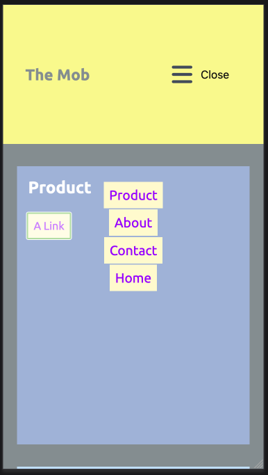
What we need to do is commonly referred to as trapping focus and is quite easy to achieve now. You can use the inert attribute on the element(s) that contain the links you don't want to focus.
Note that inert only has 89% (September 2023) has 93% support (April 2024), however, since Firefox added support from version 112 in April of (2023) I am all for it.
Please check inert on Can I use for latest support percent
To add inert to your element, we can do this in our menu function. Add the below code to your JavaScript.
const menuToggle= document.querySelector('button.mobile-menu-toggle');
const mobileMenu= document.querySelector('nav.mobile-menu');
+const mainContent= document.querySelector('main');

menuToggle.addEventListener('click', function () {

  if(mobileMenu.classList.contains('open')){
    mobileMenu.classList.remove('open');
    menuToggle.innerHTML = 'Menu';
+    mainContent.removeAttribute('inert');

  } else {
    mobileMenu.classList.add('open');
    menuToggle.innerHTML = 'Close';
+    mainContent.setAttribute('inert', 'true');
  }

})
The above code fixes the issue, and now the tab index and focus are effectively trapped in the mobile menu.
Do not add this to the HTML or body, as you will make the menu also inactive. But do note that you may need to add it to more than one element if you have a separate footer element outside the main content, for example.
But I want to get full support!
How to Support all browsers using @support
To cover the rest of the browsers we will need to use an older technique.
Depending on the needs, there are a few ways to do this.
- Add display none on the inert element. inert will still be added so we can still check for it and use it.
- If you want to keep the same design, in this case, the transparent background on the menu overlay then you'll need to target all the links in the element that is inert and add tab-index zero to them to remove them from the tab-index.
- Or you could return the focus to the first link in the menu when you hit the bottom link. This could be controversial though as standard functionality is for the focus to go to the browser controls, namely tabs then back button and so forth.
I am going to keep this simple for now and use technique one in the list above.
The below code will work to fix the issue for the browsers that don't support the inert attribute. Note that display none is a valid way of doing this, so if your menu doesn't use a transparent background like I have here then you could use a class and display none. In the case of a full-back for older and less capable browsers, I am happy to use an opaque background.
main[inert] {
  display: none;
}
@supports selector([inert]) {
  main[inert] {
    display: revert;
  }
}
Some other menu types that you need to be aware of are menus that only cover half the screen, they slide out or the body is scaled to make it look like it is a layer. These sorts of advanced styles of menus will need to have the same treatment, namely trapping the focus within the menu. The one takeaway from this is you need to be aware of this and if you design some fancy-looking menu you have to be aware that it will take extra to make it accessible. Be sure that all stakeholders are also aware.
That's it for focus trapping let's keep trucking.
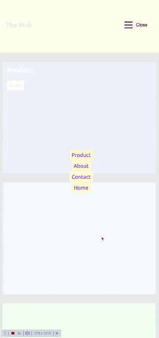
Add overflow: hidden to the HTML and Body when the menu is open to stop scroll
It's a good idea to add overflow none to the HTML and body while the menu is open. This stops scrolling on the page when the menu is open as illustrated below.
We do this using JavaScript to remove and add a class to the body.
const mainContent= document.querySelector('main');
+const body = document.querySelector('body');
mainContent.removeAttribute('inert');
+ body.classList.remove("mobile-menu-active");
} else { mainContent.setAttribute('inert', 'true');
+ body.classList.add("mobile-menu-active");
}And then add the below rule to the CSS. Easy!
body.mobile-menu-active {
  overflow: hidden;
}
Other considerations: Functionality and Features that you may need (or want to add to your Mobile menu)
Longer menus
On smaller devices, you may find the links at the bottom of the menu are hidden. If this is the case, you will need to add overflow scroll and also add margin bottom to the inner div.
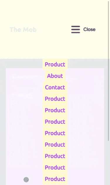
Please check longer-menu branch: longer-menu compare to the main branch
As you can also see the architecture of the layout will need rethinking as the close button is in a somewhat strange place. We won't be doing this now but if your menu is long and needs scroll then you will need to think about this. A good challenge. How would you solve this?
Animations in and out
The current menu just appears when you click the menu button and disappears when you click the menu button. We can use a CSS transition to fix this. For the sake of keeping this simple, we will use a simple fade and cover more advanced transitions in another article.
To see the diff please see the commit from the simple-transition branch on GitHub.
Note: because of the way transitions work we need to add the display property to the child and then add the transition to the parent. You cannot transition something that has display none set on it.
A second point I want to point out is that you'll also need to make the height: 0; when the menu is closed and make it 100vh height when open. I have added another commit to make this small fix. We need to do this so that the menu isn't covering the page making it unusable. Yes, element with an opacity set to 0 are still on the page, you just can't see them.
As well as adding a fade you might want to add a close button in place of the hamburger icon. There are many ways you can do this, including animating the between the hamburger icon and a close button. I will cover this in another article but for now, you can check out a hamburger icon library on GitHub.
Make the Hamburger invisible to desktop
This probably goes without saying but add a media query to hide the mobile menu for desktop views. Even though you see a lot of sites these days using a hamburger menu on desktop, I would advise against this as it makes the user experience a 2 interaction process. Why do this when you have a lot of screen real estate to use? On desktop have the top-level menu items visible at all times for the best UX.
Summary
You can check the final menu here https://designkojo.com/demos/simple-mobile-menu/
Okay, now we have a simple one-level mobile menu that is accessible and allows people to navigate your site on their mobile devices. Congratulations!
In this two-part article, we have covered a lot to make this simple menu. We used correct markup, learnt how to display the menu on click of the menu button, added a subtle animation when interacting with the menu, and it is accessible. If you got this far, you now have all you need to add a fully accessible menu to any site you are working on.
In upcoming articles, I will cover more advanced multi-level menu navigations and a lot of other interesting front-end development and design topics for all levels. If this sounds interesting to you, then please sign up for my design development and tech newsletter, a short weekly newsletter to make you excited about front-end development and design.
Thanks for reading and till next time. Have a great day!
Add new comment