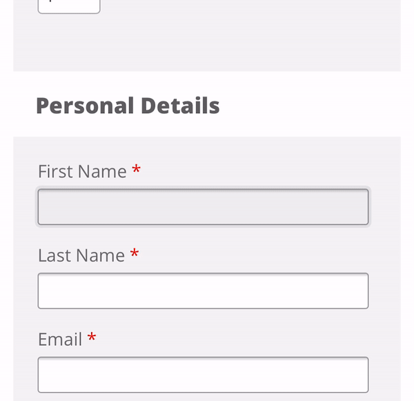
The Problem
On mobile devices, if the font-size is set to less than 16px the user of the form will get a jumpy and unpleasant experience when clicking in an input element. This is because mobile browsers require input font-sizes to be at least 16px.
The Fix
Explicitly Set font-size
If you are using a library or have made you input font-sizes small on desktop be sure to set a mobile size or better still use default size for mobile and progressively enhance for desktop using a min-width media query.
Below is the code you need add, it selects all form elements that allow a user to add text.
select,
textarea,
input[type="text"],
input[type="submit"],
input[type="email"],
input[type="password"],
input:focus {
  font-size: 16px !important
}
Do Not Set Viewport user-scalable to no
I have included this solution mainly to point out that even though it does work it should not be use, as noted on MDN using user-scalable=no can cause accessibility issues with users, allowing users to zoom in and out on mobile devices is recommended.
Below is the viewport meta tag with user-scalable=no, no need to add this as default is yes.
<head>
    <title>viewport meta tag</title>
    <meta name="viewport" content="width=device-width, initial-scale=1, user-scalable=no">
</head>