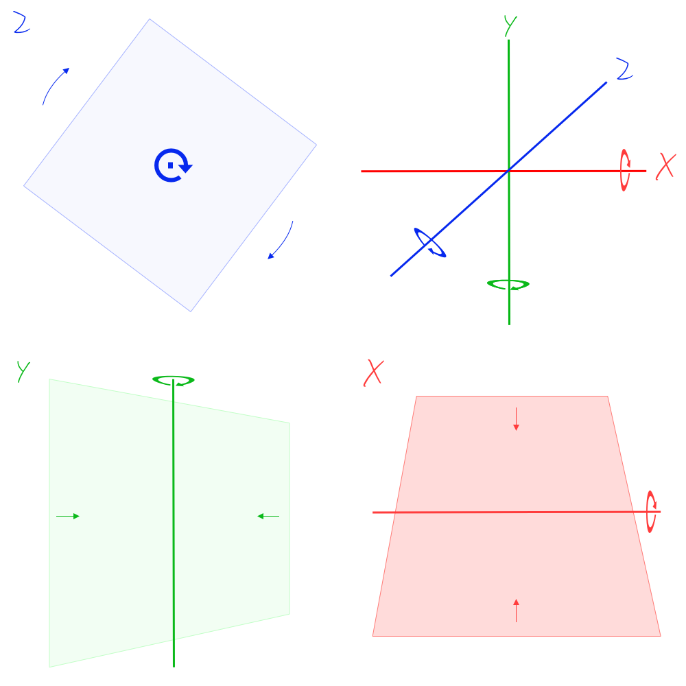
In this article, I will be explaining how to make a 3D cube in CSS.
Before I start I want to note I have used Flexbox to demonstrate this but Flexbox (display: flex;) is not needed1. Items should be placed absolute in a wrapper div or element with the outer element set to relative.
1If you want a 3D item to sit in the middle of a larger wrapper element then flexbox can still be handy but as you will see in the second part making the wrapper a set size and then making all the elements/faces of the item relative makes the object more re-usable.
So to make it clear Flexbox is only being used to demonstrate how the transform values work on the separate faces to keep them spaces nicely. I will point out the unneeded property values as we go and provide the complete items code in the second part.
Let's get stuck in.
Setting up the workspace
The below code will create the above demonstration minus the yellow square and the black normal line.
<div class="wrapper-transform-cube">
  <div class="transform--inner ">rotateY 45</div>
  <div class="transform--inner ">rotateY 135</div>
  <div class="transform--inner ">rotateY 225</div>
  <div class="transform--inner ">rotateY 315</div>
  <div class="transform--inner ">rotateX 90</div>
  <div class="transform--inner ">rotateX -90</div>
</div>
/* 3d Transform/Perspectives
*/
.wrapper-transform-cube {
display: flex;
flex-direction: row;
justify-content: space-around;
width: 90vw;
height: 12vw;
margin: 4em auto;
border: 1px solid black;
background-color: rgba(173, 255, 47, 0.48);
/* Setting up the 3D space */
perspective: 100cm;
transform-style: preserve-3d;
}
.wrapper-transform-cube .transform--inner {
width: 12vw;
height: 12vw;
border: 0 solid black;
background-color: #1cc9fe;
}So we have the setup done with 7 squares in the wrapper. The wrapper has a 3D perspective set on it and transform-style. For now, I won't go into detail on these properties but for 3D we need them on the wrapper.
perspective: 100cm;transform-style: preserve-3d;
I have coloured the wrapper and added a centre line so we have some perspective to compare to as we go through steps. These are not included in the code sample above, neither is the 7 square on the left.
I have also added some text to explain the faces, namely the rotation we are going to do. The 7th square on the left is there as a reference so you can see what the transform operations do on the element looking straight on.
Rotate the faces of the cube
There are many ways we can manage the rotation of our squares which will become the faces of the cube. We could rotate the 4 sides on the Y-axis at 0˚, 90˚, 180˚, and 270˚ or any combination of values 90˚ apart. For this demonstration, I am going to use the angles 45˚, 135˚, 225˚, & 315˚. I will mention this again later as to why I used these values but for now, just remember they are at 90˚.
Below is the CSS needed to rotate the faces and the corresponding background-color. You will see that I have added these transforms to each individual face using a new class. For these to work you need to add the class to each face class attribute value like the following example.
-  <div class="transform--inner">rotateY 45</div>
+  <div class="transform--inner transform__inner--rotateY45 ">rotateY 45</div>
/* Rotate Cube Faces */
.wrapper-transform-cube .transform__inner--rotateY45 {
background-color: #fe3136;
transform: rotateY(45deg);
}
.wrapper-transform-cube .transform__inner--rotateY135 {
background-color: #6bfe79;
transform: rotateY(135deg);
}
.wrapper-transform-cube .transform__inner--rotateY225 {
background-color: #1cc9fe;
transform: rotateY(225deg);
}
.wrapper-transform-cube .transform__inner--rotateY315 {
background-color: #fcfe79;
transform: rotateY(315deg);
}
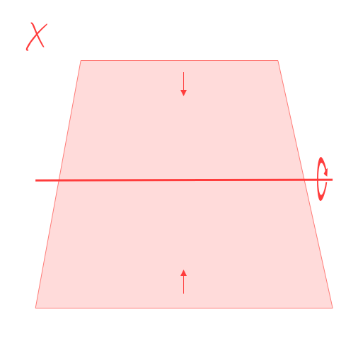
.wrapper-transform-cube .transform__inner--rotateX90 {
background-color: #f6a822;
transform: rotateX(90deg) rotateZ(45deg);
}
.wrapper-transform-cube .transform__inner--rotateX180 {
background-color: #f6a822;
transform: rotateX(-90deg) rotateZ(45deg);
}With that, we can now see our cube faces rotate. I also rotated the faces on the right 90˚ and -90˚ on the x-axis for the top and bottom respectively. You can't see the top and bottom now. You can also see how rotating the faces for the sides cuts through the yellow wrapper, this is the transform-style: preserve-3d in effect.
Rotate the outer wrapper
To see the top and bottom we can tilt the wrapper on the x-axis
Using a negative deg value we can see it from above and positive from below. There you go, top and bottom insight.
/* 3d Transform/Perspectives */
.wrapper-transform-cube {
  display: flex;
  flex-direction: row;
  justify-content: space-around;
  width: 90vw;
  height: 12vw;
  margin: 4em auto;
  border: 1px solid black;
  background-color: rgba(173, 255, 47, 0.48);
  /* Setting up the 3D space */
  perspective: 100cm;
  transform-style: preserve-3d;
+ transform: rotateX(-30deg);
}
Make the Inner Elements Absolute
The next step is to remove the spacing on the element, as I said this spacing was added just to illustrate what is happening in the 3D space. To do this all we need to do is add absolute to the faces. Since we have Flexbox space around they all go to the centre, boom!
.wrapper-transform-cube .transform--inner {
  width: 12vw;
  height: 12vw;
  border: 0 solid black;
  background-color: #1cc9fe;
+ position: absolute;
}
Look at the top view to explore the thinness of the elements
A quick detour to look at it from the top as it seems we only have 2 faces now.
Note I have only tilted the wrapper to 89˚, this is because at 90˚ we won't see anything due to CSS elements not having any depth, but at the same time, they are 2 sided. This is one of the limitations of CSS in the 3D space, something I won't talk about here but will do in the future. It is something to keep in mind.
.wrapper-transform-cube {
- transform: rotateX(-30deg);
+ transform: rotateX(-89deg);
}As stated it seems we only have 2 faces now but that is because the 45 and 225 faces are on top of each other and the 135 and 315 faces are on top of each other. Let's fix it by switching back to our above view and translate the faces.
Translate on the Z-Axis
To translate an item is to move the face along its axis or its plane, let's have a look at the following image to see what that means.
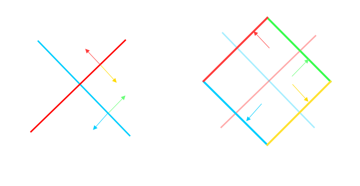
As the image illustrates you can move an element along its axis or plane relative to itself, this is actually crucial to understand. See how the elements at 45 degrees translate on the z-axis actually move out on the same angle?
These are like our faces of the cube, one of these is rotated 135˚ and the other 315˚, the ones rotated at 45˚ and 225˚ are hidden as explained earlier. When you translate these faces on the same z-axis by the same value they move away from each other. The elements remember which side is front and therefore the translate will be in the exact opposite direction for planes at 90˚ to each other, cool aye?
Add translate to the 6 sides of half the width of each face and see what happens?
.wrapper-transform-cube .transform__inner--rotateY45 {
  background-color: #fe3136;
- transform: rotateY(45deg);
+ transform: rotateY(45deg) translateZ(6vw);
}
Top and Bottom
The top and bottom had been left until now but usually, they would be transformed the same as the other faces so to finish up I'll make them absolute and make all the faces have slight transparency added.
To wrap up let look at the same cube made with the initial faces rotate at 0˚, 90˚, 180˚, and 270˚.
Rotate Cube faces at 0˚, 90˚, 180˚, and 270˚
See why I rotated them at 45˚, 135˚, 225˚, & 315˚ for this demonstration, the way to fix this is to rotate the wrapper by 45˚ and then we get the same. I didn't do it this way so we could use the wrapper looking straight on and not at the angle.
Rotate Cube faces at 0˚, 90˚, 180˚, and 270˚ and wrapper at 45˚
I will be taking a deeper look in the next article so be sure to sign up to get first access and be in the know about other awesome stuff coming to the interwebs soon.
Thanks for reading!
Add new comment