It's more than 10 years since I have explored the idea of using Using Photos as Inspiration in Web design. It was always going to come around for me to write about this again. I guess I have never stopped living by this idea of using photography in my work. I have subconsciously used it I am sure, I snap photos pretty much daily either on my phone or my worse-for-wear d7200 Nikon, God bless her.
In the last few years I haven't practised photography as the art form I use to, in that I go out and shoot photos as a series or to print, so the photos I shoot or the images I capture are a study of composition and colour. Composition or colour are important as to have these correct is important to tell a good story.
I once wrote an article about this after I had the chance to write for Sitepoint. Sitepoint used to be my go-to site for web design and development and also books. I think I bought almost every book they brought out. I was on their first-ever online course, Kevin Yank JavaScript, and helped test their online teaching platform. I still check their stuff and so should you.
So when Sitepoint had a photography contest I put my skills to hand and won a few days and somehow got first place overall or at least 1st place shared? And my grand prize was Photography for the Web book, a T-shirt, and I got the chance to write an article. That article is still online and I have also snapped it to PDF for eternity.
Wow, that was a lead-in, wasn't it? But what I was trying to illustrate was I have been passionate about web and design and photography for as long as I can remember and it is only through ongoing practice that you can develop your skills. Even more important in this day and age.
Using Photos for Inspiration in 2023
In 2022 or when this article finally gets published, 2023, the same idea remains true. That you can look at everyday things and get inspiration for colour and composition. You can see colours that work together and see things that feel right. I say that you see things that work but generally, you won't see things that work, you will see things that don't work or seem unique. It's a good sign if you don't get that feeling of something being wrong, then your subconscious will process it as all-okay and you won't actually see it. You will get a feeling of Wow I really like this without knowing why. This is what you want to achieve.
This last idea could be a whole article in itself as sometimes it is the small quirks that will create something that's slightly new. In the end, it is totally subjective. Sometimes you might purposely want to create unbalance. This though is a conversation for another day.
Using your Camera to frame stuff
Sounds like a good detective movie but more seriously, using your camera gives you the tool to frame stuff. Now you artificially frame what the eye sees. You can crop stuff out of your peripheral vision. This allows you to make your own compositions. This is analogous to the layout of a webpage or application in that you have a set canvas and therefore you need to get sizing and placement correct to make the composition. As well as the placement of objects, you need to get placement or balance of colour, especially if you have contrasting colours. Balance of colour is something I remember my art school teacher teaching me, I little dab of yellow on the right to balance the big block of yellow in the top left. It's a simple rule but it works. If you use the rule of thirds to place your objects or colour you'll produce even more harmonious compositions, it's almost like magic.
Since I am writing this article to resurface the idea of using photography and capturing images to aid in design I am going to use a few examples of some photos I have taken. We will look at what I was trying to capture or what I had seen and wanted to frame.
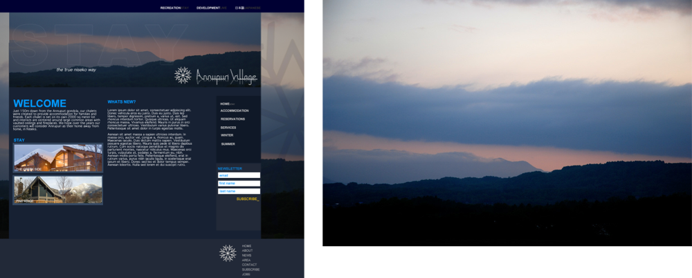
Let's first start by looking at the website I designed back in 2008 that I mentioned in my Sitepoint article.
Using Photos for Colour and Feeling
When starting out with the design of this site I had a colour which was blue and that was about it. There was a basic website but not what was needed. I was pretty much given free rein to create a new look and feel; a brand.
I started by using some basic layouts, using the golden ratio and the rule of thirds, and a palette of colours. I also had a bunch of photos to use which were helpful but for the main hero photo, I don't think we really had anything.
At some stage in the design process, I snapped a photo that seemed perfect for the feel of what we were trying to do so I used it in the design. I may have adjusted the colour palette at this stage; it is long ago now that I would be lying to say that I remember. Design is an irritative process.
Then a second similar photo I had taken inspired the full-colour palette for the sister property and real estate development site. The photo influenced the colour and also set the tone which was to attract people interested in buying land and homes in the northern mountains of Japan. It also worked with the initial photo so that the two parts of the business, even though they were separate, felt like they were part of the same site. The photo also added to the design as it was not overpowering but added a nice asymmetric line that broke up the rigidness of the grid. I feel this is a good example of where a photo can be used to inspire a design but then almost be the centre of the design, however, this does not always need to be the case.
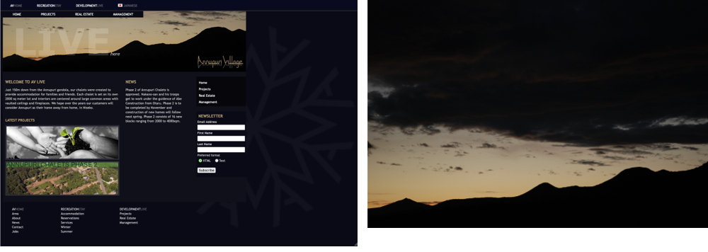
Even though the sites are not live, they were triumphant and received well by my clients and others at the time. They were used for nearly 12 years, unfortunately, they didn't survive 2020.
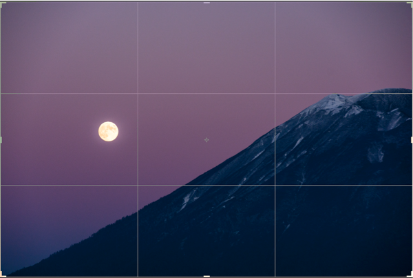
A Study of Composition and Layout
The next example is going to look more at an abstract example where the photo taken is nothing special in itself but you can see that I was studying the law of thirds. This is the law that says if you place something on one of these lines the balance will feel right. It is closely related to the Golden ratio but a more simplified version. The golden ratio is 1.663 which equates to 61% and 39%. These numbers are good to remember as well but thirds in a design grid are much easier to use.
Depth of Field in Design
I am going to go back to the original article I wrote again as I feel this is a good example of where I went out with an idea to practice a design principle. In that article, I wrote about how I went to the Fuji Rock festival and one thing I practised was the depth of field.
I feel this is now even more relevant today as with modern techniques and the advancement of technology in browsers compared to 10 years ago the feeling of depth of field is now easier to implement on the web.
Recently, or not so recently, I have been taking photos of the beer I drink, hmm beer. In doing so I always try and take the best product photo I can, so I am always experimenting.
The iPhone has a neat feature for profile pictures. You may have already tried this but if you haven't the profile functionality on the iPhone can produce some excellent effects for things other than people. Below are a few examples of playing around with the feature and you can see the depth of the field in action.
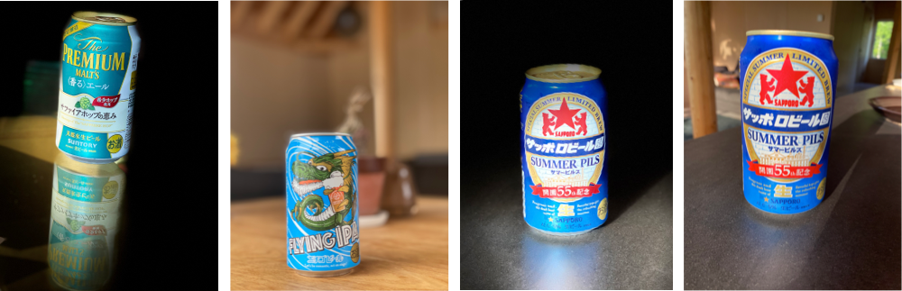
As the above examples show, the photos don't always need to be used directly in your web design, but the techniques you study can be.
Modern cameras have many features like this built in and I challenge you to experiment with them.
Other camera controls you can use in photography are shuttle speed, F-stops, ISO or grain. Actually, at its simplest, that's all there is to use in photography: shuttle speed, F-stops, and ISO.
Practising and Familiarizing yourself with design rules and principles
So far we have looked at my own use of photography with examples. However, you will want to experiment and practice with other principles, so I am going to finish up by listing other principles you can explore and in the future will cover them here on design kojo.
This is not an extensive list but it's a start. You can research these online or check out my article on design for some of them:
- Rule of thirds
- Golden Ratio
- The 7 Gestalt Principles
- Colour rules
- Type scales
By knowing some of these basic principles, you can explore them by yourself and then use them in your photography, art, and design work.
Then by exploring these principles in your work, you can transfer the concepts into web design. This is not an extensive list either but here are some design rules or concepts to help with getting your designs consistent and pleasing to look at.
- Colour and layout
- Layout and grid
- White space
- Scale
- Colour
- Depth of field
You may look at the principle and then the rules and concepts and wonder where the difference is. In all honesty, these are fully transferable and I have only split them like this to show how closely they are related.
A lot of these concepts I cover in my article, design: the next steps, so if you haven't already read that and want somewhere to get started on designing a website, I suggest you read it.
Breaking the rules
As with everything, rules are made to be broken. Remember though it isn't until you know the rules that you can break them. Once you break a rule you'll know why what you are doing does not work and how to fix it. Sometimes it will work though. This is subjective though so if you are unsure going with the rule is the best option.
Summary
In this article, we looked at how you can use photography to study design principles and how photos can be used to inspire your design. I first looked at how photography and art, in general, have always been part of my life and how I have used photography to influence my design work; mainly through serendipitous occurrences and moments. These moments really only occur through ongoing practice in composition using the frame of the camera to snap a balanced and pleasing image.
After this, I looked at the design of the site that I mentioned in the SitePoint article I wrote and how photos influenced not only the design of the site but also almost entirely influenced the sister site.
I then looked at a few design principles with examples to show how you can go out with a goal to practice a design principle that may end up as an influence for your design work. This illustrated that it is only through daily practice that you can get better at your craft.
I finished up by listing out some design principles that you can use in your web design and your photography to get the balance correct, whether it be composition or colour balance. This was a list that you can research yourself for now but will cover here on design kojo in the future.
Well, that's a wrap for now. If you enjoyed this article and would like to learn more about the crossover of design and tech be sure to sign up for my newsletter. Pop your best email in the form below. Until next time, be cool!