Pseudo-class selectors are great for targeting certain elements in your HTML documents and styling said elements in a certain way. An example of this is styling the first paragraph in an article differently using the first-child pseudo-class selector. Let's take a quick look at how this works. The HTML below shows 2 paragraphs wrapped in an article element and the CSS targeting the first paragraph in the article and setting the font-weight: bold. The nice thing about this is now all first paragraphs inside an article element on our site will be bold.
<article>
  <p>
   Pseudo-class selectors are great for targeting certain elements in your HTML documents and styling said elements in a certain way. An example of this is styling the first paragraph in an article differently using the first-child pseudo-class selector. Let's take a quick look at how this works
  </p>
  <p>
  The HTML below shows 2 paragraphs wrapped in an article element and the CSS targeting the first paragraph in the article and setting the font-weight: bold. The nice thing about this is now all first paragraphs inside an article element on our site will be bold.
  </p>
</article>
article p {
font-weight: bold;
}For more on pseudo-classes, you should visit MDN as it is a great resource to learn the basics.
In this article, I want to introduce using the same type of tree-structural pseudo-class as a conditional. However, instead of :first-child I will use :last-child. Let also look at what else you will learn first.
What will you learn?
- Pseudo-class selectors.
- CSS order precedence.
- Practical CSS Grid and Flexbox.
- Child combinator
Combining :last-child with a class so it will only return true some of the time
When writing about Drupal themeing, in part two, I was making a theme with only CSS. Relying 100% on the base theme for the HTML templates I needed to somehow set the content region width to the full wrapper width when the sidebar was empty. Below is the section of HTML I had to work with and the CSS for large screens.
<main role="main">
    <a id="main-content" tabindex="-1"></a>{# link is in html.html.twig #}

    <div class="layout-content">
      {{ page.content }}
    </div>{# /.layout-content #}

    {% if page.sidebar_first %}
      <aside class="layout-sidebar-first" role="complementary">
        {{ page.sidebar_first }}
      </aside>
    {% endif %}

    {% if page.sidebar_second %}
      <aside class="layout-sidebar-second" role="complementary">
        {{ page.sidebar_second }}
      </aside>
    {% endif %}

</main>
As you can see, the aside(s) are wrapped in conditionals and therefore are only shown if there is content placed inside the region. If you are writing your own templates you could add classes dependent on if aside content existed and then use those. But I was not adding templates to this theme so I needed another way to control output.
main {
  display: flex;
  flex-direction: column;
}

/* Wrapper display set to Grid for displays over 767px */
@media screen and (min-width: 768px) {
  main {
    flex-direction: row;
    flex-wrap: wrap;
    /* If Grid is support it will override Flexbox.
     * This means all properties that follow won't work.
     */
    display: grid;
    grid-template-columns: 2fr 1fr;
    grid-template-rows: fit-content(100px); /* This is calculate, Auto can infact be used */
    grid-auto-rows: minmax(max-content, 2fr);
    grid-gap: 2rem;
  }
  main > .layout-content {
    flex: 1 1 60%;
    grid-column-start: 1;
    grid-column-end: 2;
    grid-row-start: 1;
    grid-row-end: 3;
  }
  main > aside {
    flex: 1 1 30%;
    grid-column-start: 2;
    grid-row-start: auto;
    height: min-content;
  }
  main > aside.layout-sidebar-second {
    flex-basis: 100%;
  }
}
(Link to Github: Coming Soon)
I had worked on a more complex use of using :last-child and :nth-of-type() pseudo-class selectors, so I figured I would try and use a similar approach. Below is the solution and it is so simple that I kick myself after trying to do mental gymnastics and making a few sketches with a good òle pen and paper to figure it out.
main > .layout-content {
  flex: 1 1 60%;
  grid-column-start: 1;
  grid-column-end: 2;
  grid-row-start: 1;
  grid-row-end: 3;
}
+/* If aside isn't present */
+main > .layout-content:last-child {
+  flex: 1 1 100%;
+  grid-column-start: 1;
+  grid-column-end: 3;
+  grid-row-start: 1;
+  grid-row-end: 3;
+}
  main > aside {
    flex: 1 1 30%;
    grid-column-start: 2;
    grid-row-start: auto;
    height: min-content;
  }
  main > aside.layout-sidebar-second {
    flex-basis: 100%;
  }
}
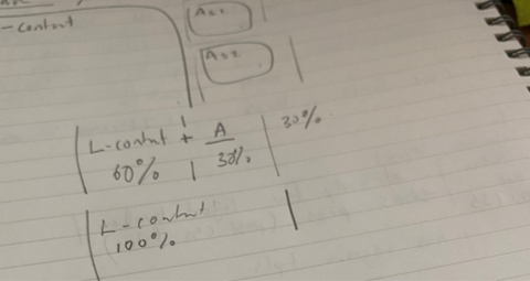
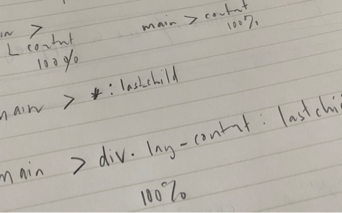
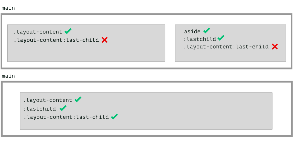
The code targets the layout-content div element, which by default is set to span 2/3rds of the Grid, and adds the :last-child selector to it. The new rule, which follows the default rule, overrides the default rule and makes layout-content span 100% or start column 1 and end column 3.
This works because the .layout-content will only be the last child if the asides are not present.
Also, note I am the child combinator (>) placed between the main and layout content. The child combinator matches direct children of the parent element.
So that's it, now as a front-end developer, you can implement designs without the need of going back and re-writing templates generated by backend systems such as Drupal or WordPress, but instead by tapping into the power of pseudo-class selectors.
I hope you found this interesting, if you want more of the same, solving problems with only CSS, small JavaScript projects, including Vue.js, or themeing Drupal and front-end in general be sure to sign up to the newsletter!
Thanks for reading and see you again soon!