Web accessibility is a huge area covering everything from perceivable to operable to understandable plus other areas such as robustness and conformance. There is no way that one article could cover it all. If you are interested in the full guideline I suggest you visit Web Content Accessibility Guidelines (WCAG) 2.1 on W3C.
In this article, we will look at colour contrast, what it is, why it is important, how to measure it, and how to include it in your design and development process.
What is Contrast?
Contrast is the relationship between the foreground, the text, and the background colour's luminance or brightness. Based on relative luminance or brightness of the foreground colour and background colour a contrast ratio is calculated in the range from 1 - 21 commonly written 1:1 to 21:1.
The Science
We are not going to go into how the ratio is calculated as the tools reviewed below can do this for us. If you want more information I have included direct links to the relevant definitions, but to keep it simple here is the equation on how to calculate the contrast ratio.
(L1 + 0.05) / (L2 + 0.05)
where
- L1 is the relative luminance of the lighter of the colours.
- L2 is the relative luminance of the darker of the colours.
A note on colour contrast that might be hard to grasp at first is that colour or hue is not measured, it is the relative brightness of the colours.
https://www.w3.org/TR/WCAG21/#dfn-contrast-ratio
https://www.w3.org/TR/WCAG21/#dfn-relative-luminance
Requirements
The requirements are quite simple and there are two levels.
AA requirements - Minimum
Colour contrast of 4.5:1 or 3.0:1 for large text
1.4.3 Success Criterion 1.4.3 Contrast (Minimum)
AAA requirements - Enhanced
Colour contrast of 7.0:1 or 4.5:1 for large text.
1.4.6 Success Criterion 1.4.6 Contrast (Enhanced)
Large text is 120% - 150% larger than the body at both levels and dependent on whether it is bold or normal respectively.
Why it Matters
Making your site accessible for everyone is important to give everyone a consistent experience regardless of their age or needs, and also not to miss the opportunity in business. With 32.2 million American adults aged 18 and older reporting experiencing vision loss1 and colour-blindness affecting 4.5% or about 350 Million People worldwide2, the need should be quite obvious.
It should also be noted that most government departments and services around the globe, if not all, are required by law that information & content is accessible by all.
1https://www.afb.org/research-and-initiatives/statistics/adults
2https://www.colourblindawareness.org/colour-blindness/
Assessing and Fixing
There are lots of available tools if you look. I am only going to review a few below and if you look you might be able to find better tools. The idea of this post is to get you familiar with contrast ratio and colour. A note for those looking for whole website audits, from what I have found they are limited to paid tools and services or of course you can do manual audits page by page using the tools below.
Automated Tools
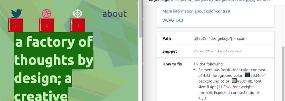
By far the easiest way to check is by using the Lighthouse browser plug-in. Search for Google Lighthouse, it's available for Firefox, Chrome, and Edge. Below is a sample report for this website, the small text under the icons is deemed to be of low contrast, in this situation it is due to size.

Another great tool that provides automated contrast checking is Accessibility Insights for Web. It's a Microsoft project and available for Chrome and Edge browsers to test web applications. There are also versions to test Android and Windows applications available for various OSes.
Accessibility Insights for Web by-line is "Solve accessibility issues before they reach your customers", which sums up perfectly the need to make your site accessible. https://accessibilityinsights.io/
Manual Tools
Browsers
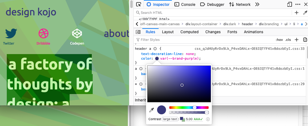
Checking colour contract in browsers using developer tools can show you contrast ratio. You can check your site and if the element doesn't pass you can use it to check a new colour on your live site right in the browser. Use the colour picker, making the element a slightly darker or lighter tone will usually do the trick.
Online Tools
The next 2 tools are online checkers, you can enter your colours and a ratio will be calculated. If you want you can use the API to get a result returned in JSON, may be useful if you are wanting to automate a huge batch of colour combinations or build a tool.
Contrast Checker
https://webaim.org/resources/contrastchecker/
Has an API that returns JSON https://webaim.org/resources/contrastchecker/?fcolor=000000&bcolor=FFFF…
Link Contrast Checker
https://webaim.org/resources/linkcontrastchecker/
Has an API that returns JSON https://webaim.org/resources/linkcontrastchecker/?fcolor=0000FF&bcolor=…
A note on using colour only for links and affordance is not good practice. https://webaim.org/articles/contrast/#only
Downloadable
Colour Contrast Analyser
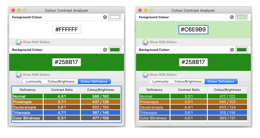
The Colour Contrast Analyser Analysis luminosity (contrast ratio), colour/brightness, and colour deficiency.
https://developer.paciellogroup.com/resources/contrastanalyser/
Latest macOS release https://github.com/ThePacielloGroup/CCA-OSX/releases/tag/2.4
Latest Windows release https://github.com/ThePacielloGroup/CCA-Win/releases/tag/2.5.0
Source code for macOS and Windows based on Electron. You will need to build yourself. https://github.com/ThePacielloGroup/CCAe
Get Right From The Get-Go
Even though this is a great start for reviewing an old site we usually want to get this right from the start of the design process. In the following section, we will look at tools in Sketch and Adobe XD.
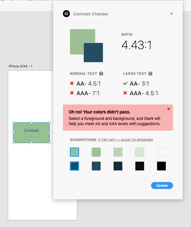
Both Sketch and Adobe XD can install Stark which gives you checks for normal text and large text. Stark has a free version that does a great job by itself or also used with the above manual tools. Stark does have a paid version, at the time of writing I have not used this, that includes smart colour suggestions and an extended colour-blindness simulations tool.
A more simple alternative for Sketch that doesn't do colour-blindness is Sketch Color Contrast Analyser, the output tells you if your text passes the relevant requirement. https://github.com/getflourish/Sketch-Color-Contrast-Analyser.
Neither tool tests for transparency or blend modes so you have to work around this by simulating your backgrounds with colour fills for your background elements.
There is a branch that does. I haven't tested it as it seems somewhat unsupported, so for now, you need to manually build elements to test. https://github.com/auxdesigner/Sketch-Color-Contrast-Analyser
Conclusions
We have looked at colour contrast in this blog post, what it is, how to measure it on an old site and how to include it in your design process with tools we have in modern design application such as Sketch and Adobe XD. So whether you are looking to fix an old site or a design a new site, this is something that you should consider. If you are designing a new site it is best you do this from the get-go so you don't have to visit it in the future or if you are adding new features to your site you should also make sure you follow the guidelines. Government regulation aside for government information it is a good idea to consider this for your private sector sites too, it's a win-win situation for the user and your business.
In following posts, I will cover other accessible issues and how to include them in your design process, plus other design and development topics to take your websites and application to the next level.