At the end of last month, I took the time to optimize this site to be accessible and used the Lighthouse tool to help do it. I had already worked on colour contrast while doing the first design of the site so if you are interested in that you can read more details in my article Why Colour Contrast is Important.
In this article, I will look at the few things I had to do to get a 100% perfect score for accessibility. First, let's have a quick look at Lighthouse.
What is Lighthouse?
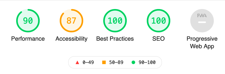
There are other tools but Lighthouse is a great start to test your site against these 4 main metrics; performance, accessibility, best practices, and SEO. As you will see it gives you good advice on what is wrong and how to fix it. Lighthouse also shows you what you passed so it is a great learning tool as well.
Where do I get Lighthouse?
Browser Plugins
To evaluate your site you can add the tool to your browser. Go to the extensions sites below and click add to browser.
Once that is done visit the site you want to test and click the little lighthouse icon.
The browser UI version is also available in Chrome Dev tools.
Web-based Version
You can use an online version if you don't want to install anything yet. If you use this online tool make sure you use the View Report link below on the URL input to get the full report.
CLI Version
For developers there is also a node CLI version, if you use this version you will have access to the most recent version. Currently, there are a few bugs in the browser versions you may come across and the fixes are included with the most recent build.
What does it measure?
The 4 metrics are below with a few notes related to why they are important and in some cases how they relate to this site in particular.
Performance
Speed of website load is important, the faster your server and site respond the less potential visitors leave. People don't like to wait for something to load so make sure this is a high priority.
Accessibility
This is one area that a good front-end developer or UI/UX developer needs to be versed in as it plays a large part in making the web accessible for everyone. It is the front-end developer's job to translate the design and ideas into accessible solutions with accessible code.
Best Practices
It seems that Drupal, what this site is built on, takes care of the best practices out of the box and most modern frameworks I would guess include them at the foundation of the work.
SEO
Took a little to set up for this site. SEO is always planned and part of the site build so passed it out of the gate too. If you want to find out about SEO for Drupal you can check out how to set up SEO in Drupal here.
PWA
The fifth metric. I know it sounds like some rap band from the '80s but it actually stands for Progressive Web Application. I won't be covering PWA and you can actually uncheck that if you wish. It is something I need to get more familiar with and in time will revisit it, offline usability through the use of services workers and web worker is something we should all keep an eye on.
Okay with the housework out of the way, let's look at accessibility.
Accessibility
As said I did this at the end of November 2020. So I will run through the report of this site and show you what I had to do to fix it. Your site will be different but with the analysis and explanation you should be able to do exactly what I did by researching fixes for your particular set up whether it be a Vue.js app, a Drupal site, a site built using a static site generator, or a lovely hand-coded HTML and CSS website, oh were those the days.
For this site, I only had to fix a few things which I will go over below but I had already taken the colour contrast into consideration. Even with colour consideration being part of the design process It still failed one element, namely the subscribe button for the email newsletter that I had done by eye and it failed. That shows that even with what you think is a good colour ratio it can still be out, the lesson is to be always testing.
The things I had to fix to get a 100% accessibility score
H4 heading was out of order
To fix I had to use HTML embed instead of using div element the data attribute and JS method. Hierarchy of heading should be in subsequential order, the email sign up is a 3rd party add-on and come with the H4
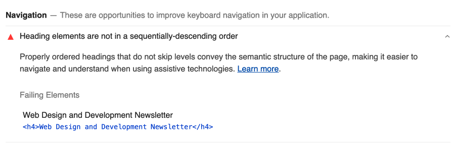
+ 1 for fixing. Changing the element from h4 to h2, unsure if this really makes sense as the form is out of the flow of the main content. To start however I had the form at the bottom of the page and this till remained true. If I learn otherwise I will add notes here.
Input and Labels Inputs
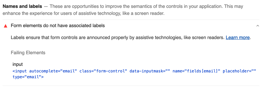
From inputs should have labels wrapping them or have the for attribute that is the same as the id attribute on the input as shown below. This was again related to the 3rd party form.
/* Wrap the input in a label element, no need to add the for attribute */
<label>
Email
<input id="email">
</label>

/* Use a for attribute to link the label to the form input id*/
<label for="email">Email</label>
<input id="email">
+10 Adjusting the input to have a for attribute on the label fixed this issue. Now the score jumps to 98.
Colour Contrast on the Subscribe button
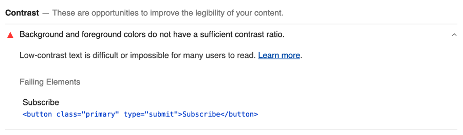
Colour contrast on the subscribe button as I mentioned above. This was my mistake as I just did the colour by eye, it was easy as making the background a little darker, as it stands the colour only passes the AA ratio, not the AAA.
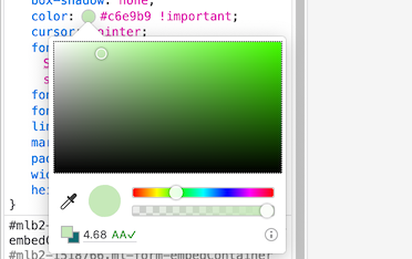
+2 to take us to 100
Final Thoughts and Comment
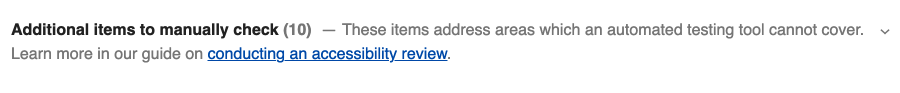
I must mention that a lot of sites don't take this seriously and that you must continue to work on your sites as over time things change and your scores will fluctuate. You add a new feature and don't test it correctly or some previously manual test will become automated. On that point I will add that Lighthouse does point you to additional items to manually check and I pointed this out in the colour contrast article too.
So you can see with Lighthouse you can not only improve your site but also learn a lot about how the web actually works; all the parts that are necessary to build a site that is truly accessible and indexable using modern best practices that perform to first paint.
Thanks for reading. If you need help with improving your site current accessibility or performance be sure to get in contact
Next up is Performance. Don't miss a beat sign up for my newsletter. A new type of newsletter.
Add new comment