If you read the first article in this series, Thinking in 3D, you would have noticed how I was using Flexbox to lay the div elements out along an axis in a container and then used justify-content with space-between to spread the elements out within the container. The container was set to 90vw (view width) and each item was set to 12vw. This allows for 6 elements to be nicely spaced out along an axis to illustrate how rotate() and translate() can be used to make a cube.
Later in that article, I used absolute to then override Flexbox's natural function of laying out the items one after another along an axis and the cube was made.
This feature of Flexbox is one of its powers. We waited for the ability to lay items out along an axis for a long time but for making a 3D cube or any shape for that matter we don't really need to use it.
Change the Wrapper and Faces sizes
In the first article, I centred the cube by making all the child items absolute in the flexbox.
Even though it was a nice way to illustrate how items are transformed in relation to each other, as you could see the faces being transformed side by side, it is in fact not necessary.
To make the cube more usable we are better to make the wrapper the size you want and then make the items 100% of the wrapper.
Let's change our code to reflect those changes.
Here is the HTML.
<div class="canvas">

  <div class="cube cube_1 ">
    <div class="transform--inner rotateY45">rotateY 45</div>
    <div class="transform--inner rotateY135">rotateY 135</div>
    <div class="transform--inner rotateY225">rotateY 225</div>
    <div class="transform--inner rotateY315">rotateY 315</div>
    <div class="transform--inner rotateX90">rotateX 90</div>
    <div class="transform--inner rotateX270">rotateX 180</div>
  </div>

 </div>
And the CSS.
/* 3d Transform/Perspectives
* Thinking in 3D
*/
.cube {
--face: 100px;
--face-tz: calc(var(--face)/2);
position: absolute;
/* Setting up the 3D space*/
perspective: 100cm;
transform-style: preserve-3d;
/* Moving and rotating cube can be overridden by separate cubes */
transform: rotateX(-10deg);
}
.transform--inner {
position: absolute;
width: 100%;
height: 100%;
background-color: #1c5ffe;
opacity: 0.7;
}
/* Cube 1 */
.cube_1 {
--face: 250px;
--face-tz: calc(var(--face)/2);
width: var(--face);
height: var(--face);
transform: rotateX(-30deg) translate3d(0, 0, 0);
}
.rotateY45 {
background-color: #fe3136;
transform: rotateY(45deg) translateZ(var(--face-tz));
}
.rotateY135 {
background-color: #6bfe79;
transform: rotateY(135deg) translateZ(var(--face-tz));
}
.rotateY225 {
background-color: #1c5ffe;
transform: rotateY(225deg) translateZ(var(--face-tz));
}
.rotateY315 {
background-color: #fcfe79;
transform: rotateY(315deg) translateZ(var(--face-tz));
}
.rotateX90 {
background-color: #d549f5;
transform: rotateX(90deg) rotateZ(45deg) translateZ(var(--face-tz));
}
.rotateX270 {
background-color: #ff6e00;
transform: rotateX(-90deg) rotateZ(45deg) translateZ(var(--face-tz));
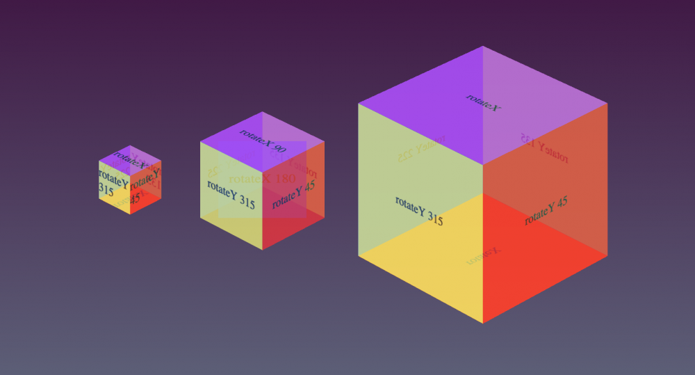
}This is what the above HTML markup and the CSS creates, you can change the custom-property --face value to easily modify the size of the cube.
Okay now we have a cube, we can adjust the wrapper size and value of the translate to be 50% of the face the size and all the cube faces also adjust. This is done automatically in the first 2 lines in the cube_1 wrapper rule.
--face: 200px;
--face-tz: calc(var(--face)/2);
You can see the --face is 200px and the --face-tz is half the face; --face)/2.
Now all you need to do is make a copy of the HTML, change the class name from cube_1 to cube-two and add a new rule for .cube-two. You can do this as many times as you like and create something like below. Well, almost like below, we need to now learn how to position the cubes.
So this is nice, but now let's say we want to add a whole lot of 3D objects and place them on the page, how would we do that?
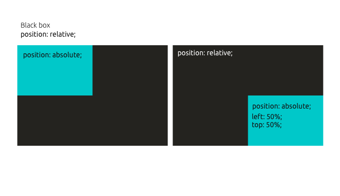
Positioning elements in CSS
There are 2 ways to position elements in CSS, well really only one way using slightly different tools and that is place the items in a wrapper with the position property set to relative on the wrapper and then on the items use position: absolute.
Once you have items in a wrapper set to absolute you can then position them using the left, right, top, and bottom properties with a fixed value such as px or a relative value such as percent. This works and is possibly the most common way to draw in and position in CSS.
Related: CSS positioning using position property
The second way I am going to suggest is maybe a better way and that is to use flexbox to "centre" the items1 and then position them absolutely to centre them. This makes everything centred as shown in the following example with the crosshair. Then you can use transform: translate3D() to move items from the centre point. This may be a debatable way for positioning elements in 2D but if you want to create 3D drawings and illustrations then I propose it is the best way.
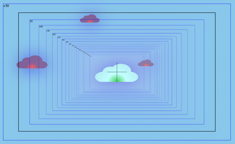
1 When using flexjustify-content:center you are actually centring all items in the flex container, however, they are still placed next to each other along an axis.
Moving around the 3D Space
To move around the 3D space you need to now understand that the centre is 0,0,0 for the XYZ axes. To move something left or up you need to use a negative number on the X-axis and Y-axis respectively. Moreover, to move something closer to you on the Z-axis you also need to use a negative value. Remember to work in 3D space you need to have the perspective set and 3D preserved on the wrapper element.
perspective: 100cm;
transform-style: preserve-3d;
To move items you use transform: translate X Y Z or 3D.
Translate works on the axis perpendicular to the face as described in how a cube is made. But let's have another quick look here.
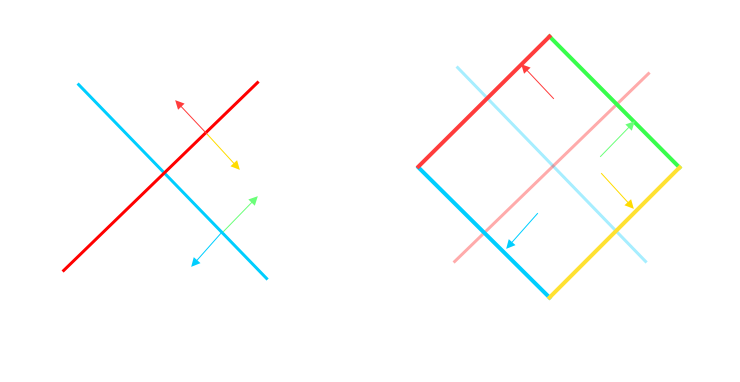
We can also rotate things. But also remember that the order you rotate and translate matters.
Creating a feel of 3D
I have found that setting perspective to 100cm is good but if you want to show more depth in a scene using 10cm will really start to show the perspective. I have written more about this in the upcoming Creating a Landscape part of this series but for a quick primer on perspective have a look at this image.
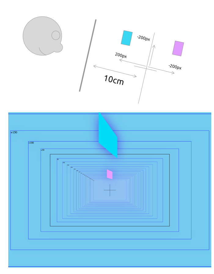
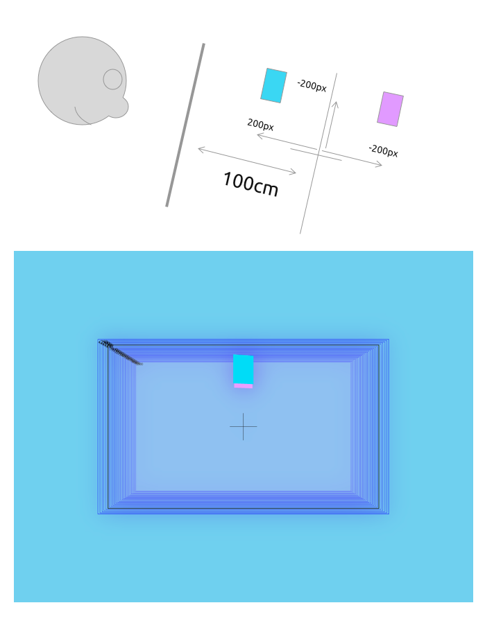
The perspective sets up the position of the 3D Z plane as seen from the viewer's screen. When you move something on the Z-axis or translate it you move it from this plane. Therefore if you set the perspective at 10cm and then translate 10cm you will no longer see the item or if the items face is longer than 10cm then it will look like it goes off the screen.
You'll notice I am using cm but you can use any measurement value you like.
I like to use cm in this context because it is kind of an arbitrary number in that it could infact be infinite. I find 900cm is flat, 100cm give some feeling of 3D but 10cm really distorts. Look the number compared to px.96px = 72pt = 2.54cm or 1inch
source: https://www.w3.org/TR/css3-values/#absolute-lengthsThat gives us:
2.5cm = ~ 100px
10cm = 400px
100cm = 4000pxOn a side note since perpective is a measurement on the Z axis and it is somewhat undetermined and as stated could be infinite, we can't use % on the translateZ axis.
In this article, we looked at creating reuse-able cubes that can be modified in size by adjusting the wrapper. We also looked at re-using elements and positioning them in a 3D space. In the next part, I will have a look at creating some different basic 3D shapes.
Add new comment