About the series type articles
This is part of a series that is written in a linear fashion as I created this image viewer. Some of the code added may not be needed in the final version but has been added to help work through the problem. If you are also learning, then it might act as a standalone learning point and that is the idea. I do not suggest that you use this in a production environment but use it as a learning tool or a starter for your project.
Welcome back! We are going to continue where we left off in part 2a. In this part we are going to do two things:
- Make the images responsive. We will look at various values of the width property so that we don't get strange behaviour on small screens. If this doesn't make sense now, don't worry I will explain the issue when we get to that section.
- Make the slider handle position use % on large screens and use pixels on screens under 1000. This is to fix some other strange behaviour and you will learn about using an if conditional.
If you don't already have the code go grab the repo from Github.
You can grab the whole repo from Github and use the restrict-top-image-wrapper-to-100% branch. How do you do this? Check out the Git going section on this site and working with remote repositories.
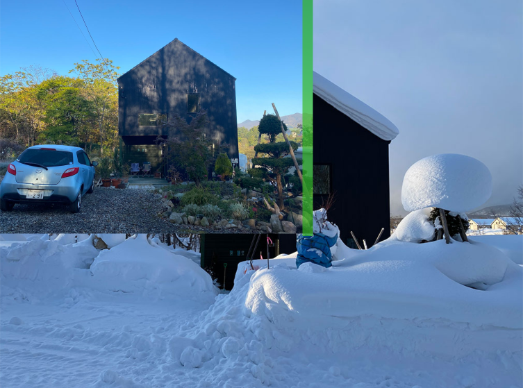
Now that we have the code let's make this Responsive
You should have the code and be on the restrict-top-image-wrapper-to-100% branch. If you have tested it you would have seen that once the browser and viewer become smaller than the full-size width of the images, in this case, 1000px, the top image keeps its current width set by the handle, albeit it is buggy, and the bottom image doesn't adjust at all. We will now fix this.
First, create a new branch using the checkout command with the -b flag. Make sure you are on the restrict-top-image-wrapper-to-100% branch to do this. Below are the 2 commands you can run.
- The first one will checkout the branch you want to start from even if it is still on the remote.
- The second command creates the new branch.
git checkout restrict-top-image-wrapper-to-100%
git checkout -b make-responsive
Next, we will make the images responsive by adding 100% width to the images and also adding the max-width property with the value of 1000px.
img {
max-width: 1010px;
width: 100%;
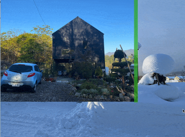
}If you check this out you will notice the top image becomes smaller than the image that is under it, as illustrated below.
Oew, what do we have here? Let's take a look and fix it.
When you set an image to 100% width the height is calculated automatically unless it is specified. We don't want to specify it as then it wouldn't be responsive and you would get stretched images. By setting the image width to 50% the image height is also set to 50%. If you drag the slider handle to the right you will see the image height also adjust.
What is happening is the image is doing what I have stated, it is 100% of the container it is in. However, the container size is changing as you move the handle. This is not what we want though.
Making Images Responsive to the View width or 1000px
The images at full size, that is 1000px, automatically set the height in relation to the width using height: auto. This is so the images keep their correct ratio. This doesn't work once you make the screen smaller and adjust the size of the image, or more correctly the image wrapper, as when the width of the wrapper gets narrower, the image adjusts to 100% of the wrapper and then height automatically adjusts to keep the image proportionally correct. Using 100% makes the image 100% of its bounding wrapper.
The fix here is to use the view width unit, vw, and also set the max-width. Do note though that for screens under the max-width then the images will be 100% of the view width or 100vw. If you want a margin you will need to set the vw to the size you want or do this a little differently. For now, let's go with images that go edge to edge.
img {
  max-width: 1010px;
  width: 100vw;
}
With that done, test it and if all good commit it.
commit: make-responsive 40692fa
branch: make-responsive
Now let's fix the handle. If you test the viewer when the screen width is less than the image full size, using % doesn't work right. I am not going to try and explain this but have a little think yourself to see why it works the way it does. To make this work, we can split the function that sets the width of the wrapper by using the handle. This function is called trackMouse()
Split Slider Handle Function to use per cent on desktop and pixels on mobile
We will continue from above on the same branch so by the end we will have a mobile and desktop version. This is not a mobile and desktop version per se, it is only screen width sizes. We will use it later to implement touch screen functionality, however.
The width value we will use is related to the width of the images, so if you were to make the reveal & hide viewer images larger than 1000px at the max-width size you would need to change it.
The idea is to check the window width and then use an if-else conditional to check if the window is less than the max width of the images. If the window is less than the max-width of the images we will use a new block of code that uses pixels to set the width of the top image wrapper else we will use the code we already have that uses %. The following steps will achieve this:
-
Make a variable for the maxWidth.
let maxWidth = 1010; -
Make a variable for window width.
var width = document.body.clientWidth; -
Make a variable for the width, the x position on the event of the track mouse position function.
const xPos = theEvent.clientX;
We now have enough variables, let's check if the value of the window is less than the max width. If it is we want to use the pixel position else we want to use the code we already have that is using the per cent.
-
Add conditional with the respective px or % to control the position of the handle.
if (windowWidth <= maxWidth) {
  // Add the new topImage width position in here
} else {
  // Add the current code in here.
}
And here is the conditional with the new code in the if block for narrow screens and the current code for desktop that uses % in the else block.
if (windowWidth <= maxWidth) {

  topImage.style.width = xPos + "px";

} else {

  let imageWrapperWidth = mousePointerPos / 10;

  if (imageWrapperWidth <= 100) {
    topImage.style.width = imageWrapperWidth + "%";
  } else {
    topImage.style.width = "100%";
  }

}
Now we will tidy up a few things that have come to my notice now that we can use the image viewer on a narrower screen.
-
In the desktop version, we had the initial width of the top image wrapper set to 550px (don't ask why it was 550px). Let's change that to 50% otherwise on screens smaller than 550px we won't see the handle when initialized.
.top-image {
- width: 550px;
+ width: 50%;
  overflow: hidden;
}
- As all good developers should be doing we need to test cross-browser. When trying this on Chrome I came across a weird effect that only happens on Chrome, the behaviour can be described as follows:
- When trying to use the handle and dragging it from left to right.
- It also only happens once the Chrome browser becomes narrower than the max-width of the image.
- The behaviour destroys the JavaScript mouse-up functionality.
-
As illustrated in the below image you can see that when trying to drag from left to right the image is selected and then the whole JavaScript script is destroyed in that the functionality becomes buggy.
To fix this I tried a few things but for now, I am going to use a holistic approach with JavaScript and turn this obscure dragging effect by returning false for the mouse down event on the window.window.onload = function() { document.onselectstart = function() {return false;} // ie document.onmousedown = function() {return false;} // mozilla }This may not be the best solution and will revisit it in the future. From the solution that I found, disable text selection in Chrome, there is a comment that says this prevents dragging of the scrollbar in Chrome.
-
One last thing we need to do is stop the handle from being able to slide off the side of the screen on mobile by adding another conditional as we have in the desktop version. Maybe not 100% necessary.
if (windowWidth <= maxWidth) {

+  if (xPos <= windowWidth) {
    topImage.style.width = xPos + "px";
+  } else {
+    topImage.style.width = windowWidth;
+  }

} else {
Now with the core functionality finished we will tidy up a few things. We will:
- Remove the height set on the outer wrapper element.
- Remove the align-items: center; which is the vertical centring.
- Add a margin-top instead.
This will make our viewer sit at the top of the screen in the centre. Not technically part of the viewer but having it sit at the top of the screen or the enclosing wrapper is better for future use.
With that done, test it and if all good commit it.
commit: make-responsive 1f2fa4f
branch: make-responsive
Wrapping up
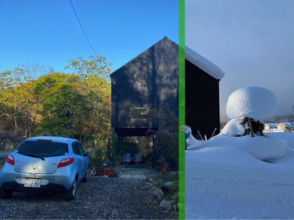
Okay, now we have images resizing correctly for all screen sizes and a handle to adjust the width of the top image. However, this will still not work on a mobile device as we need to deal with touch screens. In the next part of this article series, we will be tackling that. First by looking at how hover works on touch screens and creating a workaround and then implementing true touch functionality.
Making the Before and After Image viewer work on mobile devices
Thanks for reading and be sure to sign up for the newsletter for a mix of front-end development and design goodies straight to your inbox.