What is prefers-color-scheme?
prefer-color-scheme is a CSS Media feature that detects the user's system's preferred appearance, whether it be light or dark, and then load the styles accordingly. There is no need for a theme colour mode toggle or switcher using prefers-color-scheme and it presumes that the user has their system set to how they prefer.
The full back is light and if you have
privacy.resistFingerprinting = truein Firefox the prefers color scheme will full back to this.
Using prefers-color-scheme
/* This will only ever be rendered if prefers-color-scheme isn't support */
div {
  color: #aaf1c3;
  background-color: yellow;
}

@media (prefers-color-scheme: light) {
  div {
    color: #3e5a47;
    background-color: #fff6dc;
  }
}

@media (prefers-color-scheme: dark) {
  div {
    color: ##b9f3cc;
    background-color: #292900;
  }
}
So there is only really the need to have a default and then add a dark theme.
div {
    color: #3e5a47;
    background-color: #fff6dc;
  }


@media (prefers-color-scheme: dark) {
  div {
    color: #b9f3cc;
    background-color: #292900;
  }
}
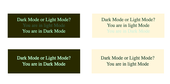
The above code will render the below, left being dark and right being light or default.

Using the prefers-color-scheme you can also tell the user which mode they are in, the following box tells you what colour mode your system is set to and makes use of a display property set to none.
Dark Mode or Light Mode?
You are in Light Mode
You are in Dark Mode
Here's the code with the display property for the above.
div {
    color: #3e5a47;
    background-color: #fff6dc;
  }
P.darkmode {
    display: none;
  }

@media (prefers-color-scheme: dark) {
  div {
    color: #b9f3cc;
    background-color: #292900;
  }
  P.darkmode {
    display: inline-block;
  }
  P.lightmode {
    display: none;
  }
}
Using :root Selector and CSS Custom Properties
Now we have the basics of how this works let's look at using custom properties to set the colour scheme in the :root element like in the below code snippet.
:root {
  --body-color: #3e5a47;
  --background-color: #fff6dc;
  --heading-color: #4e534c;
  }

body {
  color: var(--body-color);
  background-color: var(--background-color);
}
h1,h2,h3,h4 {
  color: var(--heading-color);
}

@media (prefers-color-scheme: dark) {
  :root  {
    --body-color: #b9f3cc;
    --background-color: #292900;
    --heading-color: #c5eab7;
  }
}
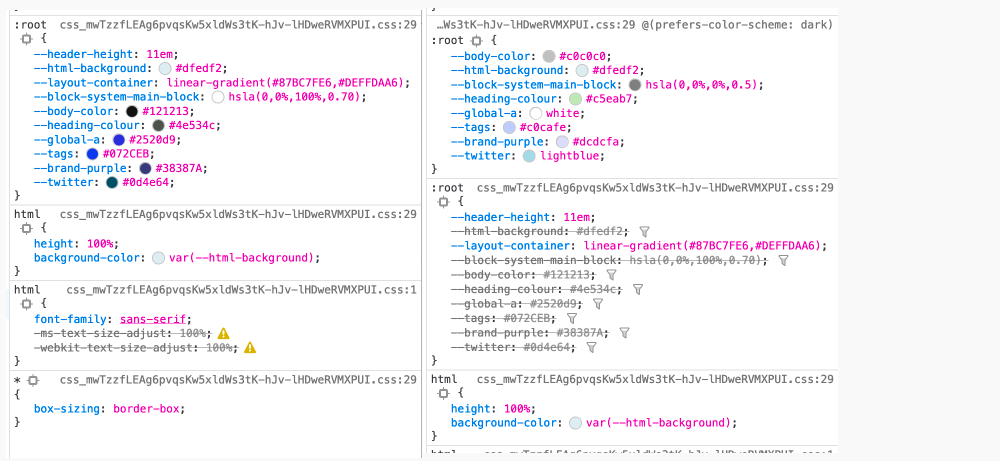
In doing this now all we need to do is override the custom properties in our prefers-color-scheme @media query's :root selector for our dark theme. Below is a screen capture for this site at the time of publishing, see how easy it is set the whole scheme in the :root selector using CSS custom properties?

Final Thoughts
With 88% support at the time of writing and full-back set to light, this is one feature that can be included with all sites and there is no reason not too. One thing to note is that it does rely on the user setting their preferred colour mode in their system settings which brings up the question should we as designers and developers add a small message box that informs users that their system supports this or should we provide a colour switcher? I'll allow you to answer that.
Secondly, if you do implement this in your themes, remember to take special care in reviewing your colour palette and that the colours you choose adhere to at least the minimum colour contrast as per the WCAG (Web Content Accessibility Guidelines). I have written about colour contrast in another article What is Colour Contrast and Why it Matters in Web Design. If you are interested follow that link and have a read.
In following articles, I will be covering mostly front-end development and UX/UI topics in an attempt to design better interfaces. I will also be covering backend from time to time in the way of server management and CMS options. Sign up now to hear it first, link at below.