Image Styles come with every Drupal installation and are key to building a great image rendering pipeline. Setting up image styles in itself won't directly affect images on your site; you need to apply the image styles to your images or use them in your responsive image styles.
Image styles are applied to images and even though you can use images as fields in your content type, it is more likely you will use Media entity reference fields and then manage the display to use the rendered entity format and a view mode. The view mode which is set up on the image media type may use an image style or a responsive image style. No matter which way you set up your images, in the end, an image style is still used to style the image's final output.
If this sounds confusing, don't worry; I will cover various image and media image set-ups later in this guide.
In this article, we are going to look at the basics of image styles so that you can use them across your site.
Getting Started with Drupal Image Styles
To get started with Image Styles, visit the image styles page:
Administration > Configuration > Media > Image Styles
/admin/config/media/image-styles
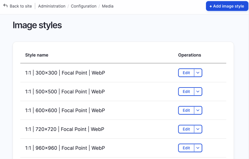
On a new default install of Drupal core there are only five image styles, however, if you have installed Drupal CMS you will see over 50 image styles pre-configured. Drupal CMS comes with responsive images set up, where each responsive image style will have multiple images styles selected.
If you look closely at the image styles in Drupal CMS, you can see the naming of the image styles has a definite pattern where the styles are nicely grouped into aspect ratio sets such as 16:9 or 4:3 and many others. I haven't used Drupal CMS extensively yet, but the image styles provided cover a variety of ratios to get started.
Even though this is great, you will probably need to create image styles if you are creating a custom design system, so let's do that now.
To create a new image style, use the + Add image style button, or to enhance a style, click on the edit button next to the image style you want to enhance.
Note: For Drupal CMS, I wouldn't modify the image styles as they are connected to responsive image styles.
Create an Image Style
Let's create a new image style.
- Click on the + Add image style button.
- Add the name.
-
A machine name will also be created; generally, you won't need to change this if you have a naming system for the human-readable names of your image styles. For a good example of a naming system, you can check the Drupal CMS images styles page, part of which I share below.
Image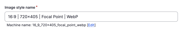
-
- Click create new style.
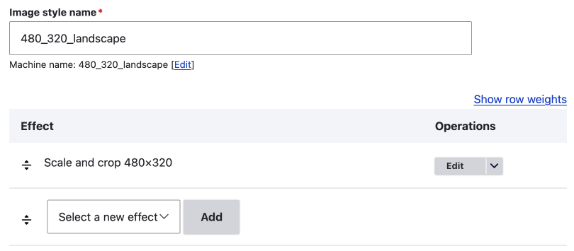
After you have created the new style, you will arrive on the edit style page. On this page, you can add effects to image styles, and the new style will be created and displayed using the preview image of hot air balloons over a forest at the top of the screen.
Edit the Image Style and Adding an Effect
On a default install of Drupal core there are seven effects, and on Drupal CMS there are 12, due to the Focal Point module and a convert to AVIF effect being included.
The default seven image effects are:
- Convert
- Crop
- Desaturate
- Resize
- Rotate
- Scale
- Scale and Crop
To get started, this may be enough. If you want more image effects, you can install contributed modules. I will cover this later.
To add a new effect to your image style:
- Select a new effect from the select menu and click Add.
- Configure the effects settings.
- Click Add effect.
That's it; now you have a new image style that can be used in any image rendering pipeline you want to set up. However, you will probably find that you will want to add multiple effects.
Adding Multiple effects to an image
This is the true power behind image styles; you can stack multiple effects so that your images are perfectly rendered for your beautiful front-end theme.
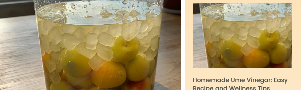
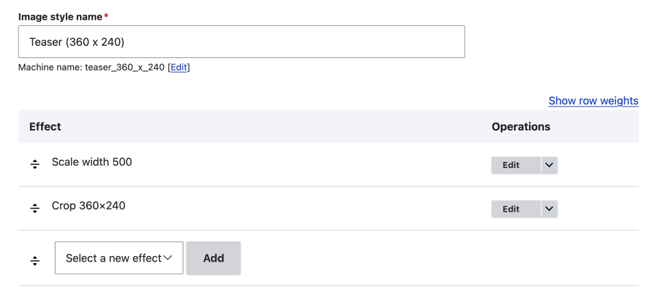
Some basic image styles I have set up using only what comes with Drupal core is to first scale an image and then crop the image. This sort of style is good for teaser images where you may have a large image uploaded that needs downsizing and then cropped to a certain size as shown below.
To add a second effect is the same as adding the first effect; select a new effect from the select menu and click add.
If you need to, you can re-arrange the effects using the re-order handle and saving the image style.
Effects are processed in the order in which they are arranged, with the top effect being applied first and so on, so it is important that you order them correctly.
The following image shows complex image style set up to create OG or Twitter images that have text added to them from a text field. If you want to learn more about setting these up, please read the Text Overlay effect and the Textimage Module article (coming next week, sign up below to be contacted once published.)
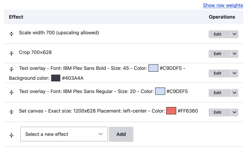
Image format
To use WebP images it is as easy as adding the convert effect to each image style and add it to the style name for good measure as is done in Drupal CMS.
This method seems good now that WebP is supported almost 100% these days (96%+ and the ~4% of non-support is random older browsers), but I have also used other methods to convert images site-wide to WebP. I will cover using the Image Optimize module with pipelines method in another article, and then revisit whether it has any benefits over adding the effect to each style.
Responsive Image Styles and WebP Image Formats using pipelines
When I started using WebP images on my sites, it was mainly for responsive image styles. In this situation, using the Image Optimize module and a pipeline with the WebP Deriver from the ImageAPI Optimize WebP module was good. It provided WebP image with JPEG fullbacks. Having fullback image formats is one of the benefits that I can see, but maybe not necessary theses days.
For now, let's say, from what I can see, the Drupal CMS method of using the Drupal core convert effect to get WebP formatted images seems solid.
Summary
Drupal image styles are a powerful feature for creating image styles that can be used on image fields, whether the field is a basic file field or part of a media type, or can be use in responsive image styles.
Accessible via Administration > Configuration > Media > Image Styles, Drupal core offers five default image styles, while Drupal CMS provides over 50 so they can be used in responsive image styles.
New image styles can be created by naming them and adding effects like Convert, Crop, Desaturate, Resize, Rotate, Scale, and Scale and Crop. Multiple effects can be stacked and reordered to build the exact image size and style you need.
For WebP images, the Convert effect or the Image Optimize module with pipelines (e.g., WebP Deriver) can be used, with the Drupal core Convert effect being the easier to implement.
Conclusion
Drupal image styles are the building block to any image rendering pipeline; whether it be a simple one-off image style added to an image or media image field or to be used in advanced image rendering pipelines, including responsive image styles. Understanding how to set them up correctly is imperative to creating a flexible and robust image management system for visual content for your Drupal-based websites. Now you have your beautiful image styles, it is time to use them. In the following article, we will have a look at how image styles are applied to your images.
Thanks for reading, be sure to sign up for the newsletter. I write about front-end web design and development; leveraging Drupal to build amazing front-end experiences.