If you want to learn more about pagination in general, please read part 1: Pagination: What it is and Why you Want to use it.
Pagination of catalogue content in Drupal is extremely easy. I am using the word catalogue here to describe lists of articles, products in a shop, or any other list of content.
If you have installed Drupal, the front page already has pagination implemented, you just need to add some content.
Once you reach 11 articles, the pagination will automatically appear. It is set to the most feature rich pagination by default. Let's have a look.
A Look at Drupal Views Pagination
The front page of Drupal is built using Views and lists new articles added to your site. You can check The Default Frontpage View of Drupal section of the Views article if you are interested in how the front page is created using Views module.
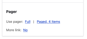
In Drupal views, you have the option of a using a pagination or no pagination and showing all results or limiting the result to a specific number. To see the options, click the on the link next to the Use pager option in the pager section on the Drupal views UI.
If you want to use pagination, you have the option of a full pager or a mini pager.
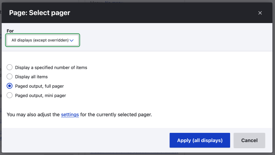
Once you have chosen how you want to display your content, whether it be every piece of content using pagination or a block of three related pieces on the home page, you will get a sleuth of options.
For full pagination, you can
- Choose heading level for the pager, necessary for good accessibility.
- Choose how many items to show on a page.
- Add an offset or the number of items to skip.
- Number of page.
- Change the pagination first, previous, next, and last wording.
- A bunch of exposed pager options which allows the user to control how the pager works.
- Show how many pager links will be displayed in the pager.
There are obviously many ways to do this, but remember you'll need to make sure it can work nicely on mobile and desktop. This can be done using CSS, as you will see in the CSS section below.
Implement Infinite Scroll in Drupal Views
You will need to install a module to implement Infinite scroll. However, it adds an extra setting in the pagination section of views. This is one example of how nice Drupal's modular architecture is in action.
To find out more, checkout the Drupal Infinite Scroll Project on Drupal.org.
How to make your Pagination Look Great
This is subjective, and I would suggest opening up your favourite design tool and playing around will some ideas to compliment the overall design of your site.
Since Drupal has the pager component, I include it all designs so that when it comes time to use, it is already to go. No surprises.
Once you have decided on the functionality and the design, it will be time to code it.
Coding the Pagination for your theme
Styling the component is almost as easy as it is to set up. You will need to add some CSS and adjust the markup if you want to modify elements.
Styling the design using the provided classes and CSS
I will be using the Starterkit markup. The classes that come will Starterkit are all you need to style your pager. To look at the classes available, you can use any modern browser with development tools.
The Starterkit theme uses a BEM syntax, so we can target the pagination and its items effortlessly.
Below is an image of the default markup, and below the image, I have listed the important classes I will use.
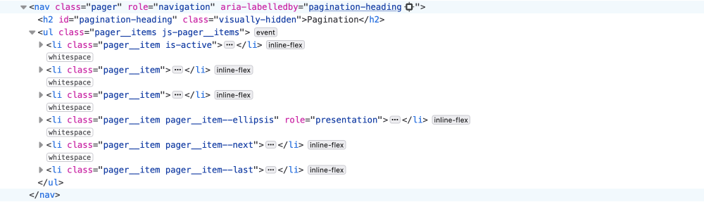
- You can see the pager is a
navelement with a class of pager. - Inside the
navit has anulelement with a class of pager_items. - Each list item in the
ulhas a class of pager_item. - Individual items have classes where needed, as listed below:
- is-active is added to the active element.
- --first, --previous, --next, and --last modifiers are added to the respective element.
Some other things to note are:
- The default markup is accessible, so you can hide the text if you like using CSS. You would need to add icons via CSS if you were going to hide the text, however.
- The active link is given a class, which can be useful for restricting the number of items to show on a mobile.
So as you can see, this makes it effortless to style.
If you want to see the styling, I have committed it to my work in progress slate theme, a clean slate that provides the basic styles to Starterkit. The code in the linked commit can be seen in the image below. Specifically, the white background version.
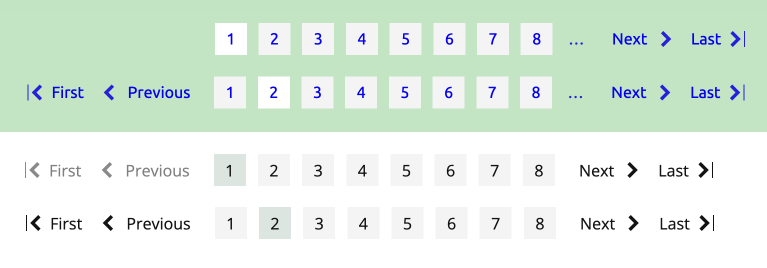
In a lot of sites I have worked on, the designs show the first, previous, next, and last items regardless of whether they are active. This is shown in the above image. If you want to do this, you will need to adjust the markup. We will look at how to do this shortly, but first I want to point out the mobile CSS.
Making your pager work on narrow screens

With modern CSS, this is easy. You can add a media query and then hide unneeded navigation such as first and last, restrict the number of page links, and even hide the text. If you check the CSS code linked above, you will see the below code that does this. Nice, now you have a mobile pager.
@media screen and (max-width: 767px) {
  .pager__item:not(.is-active, .pager__item--previous, .pager__item--next) {
    display: none;
  }

  .pager__item.is-active + .pager__item,
  .pager__item:has( + .pager__item.is-active) {
    display: inline-flex;
  }

  .pager__item span,
  .pager__item a span {
    text-indent: -10000px;
  }
}
Now let's look at how you can add a new template so you can add inactive first, previous, next, and last items as pointed out above.
Twig template: the Markup
If you want to modify the markup, you may need to add the template to your theme.
Copy the Pager twig template to your Theme
Starterkit theme provide a pager template as shown in the below image. So you can modify your Starterkit theme pager directly.
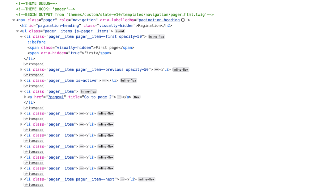
If your theme doesn't have a pager template, then copy the template from the path shown in the debug output to your theme. In the above image, the path is themes/custom/slate-v10/templates/navigation/pager.html.twig. You would copy the pager.html.twig to themes/custom/MY-THEME/templates/navigation/pager.html.twig, replacing MY-THEME with the name of your theme.
Once you have the template copied to your theme directory, you can modify the markup.
Modify the Markup of the twig template
In the comment section at the top of the template you can see the available variables, and with knowledge of Twig and basic programming skills you'll be able to achieve almost anything.
In the example markup above, I have added the previous and first, and the next and last buttons regardless of whether they are active. You can see the opacity-50 class and that the li doesn't have an anchor link, <a href="">, tag inside.
I used an else block in the conditional to render the different markup as shown below.
</li>
+  {% else %}
+    <li class="pager__item pager__item--first opacity-50">
+       <span class="visually-hidden">{{ 'First page'|t }}</span>
+      <span aria-hidden="true">{{ items.first.text|default('First'|t) }}</span>
+   </li>
{% endif %}
You can check the full code on the pager branch commit on GitHub.
Header setting was introduced in 10.3.0
While designing and developing this pager, Drupal sneaked out a small improvement where you can now adjust the pagination heading in the UI, no need to do it in the template any more.
You will see that I changed the h4 to an h2 in the above linked pager branch commit. No need to do this anymore.
A note on colour contrast and accessibility
Colour tint or shade might become unreadable for some, so you do need to think about that. Remember, that even though the markup is good for people using screen readers, that there is still a group of people that will have difficulty reading if you contrast isn't correct.
A look at Drupal Book Pagination
Drupal also provides many ways to add pagination to content. One way to do this is to use the Book module. You can see it in action on the Why use Drupal article on this site. I think it is a good module if you want to group pages into a book of content.
For more on this, I will write up a detailed setup shortly and also look at some other options.
You should note that Book modules is still a Drupal core module but has been moved to contributed modules. Since it will be removed from core in Drupal 11 you are best to use the Book contributed module if you are just getting started.
Summary
That's it, you now know how to modify the default pager in Drupal views, how to style it and also modify the markup of the default output. If you read part one, you will also know why you may want to use a pager and pagination, if you didn't read it I suggest you do as you might be surprised at some of the benefits of using pagination.
I hope this was useful for you. If you want to learn more about front-end development and design, please sign up for my newsletter below. A newsletter about Drupal, design, UX/UI, front-end development, and technology.
Thanks for reading, until next time, seize the day!