In the first part of Styling Layout Builder Pages, we looked at how you can style the sections of Layout Builder module from the Layout Builder UI. We also covered how you can add styling to regions.
In this part, we will look at how we can style the components we add to the regions. There are two modules we can use to do this, the Layout Builder Component Attributes Module and the Layout Builder Styles module.
Layout Builder Component Attributes
https://www.drupal.org/project/layout_builder_component_attributes
As the name suggests, this module enables you to add attributes to components (blocks). You can enable the following attributes:
- ID's
- Class(es)
- Style (inline)
- Data-* attributes
Enable Attributes for a block, a block title, and the block content
You can choose which attributes are added to a block, a block title, and the (inner) block content. You do this on the settings page as shown below.
From the module page: In order for attributes to be rendered on the block content (inner) element, the active front-end theme must support content_attributes in its block.html.twig file. See README.md for more information.
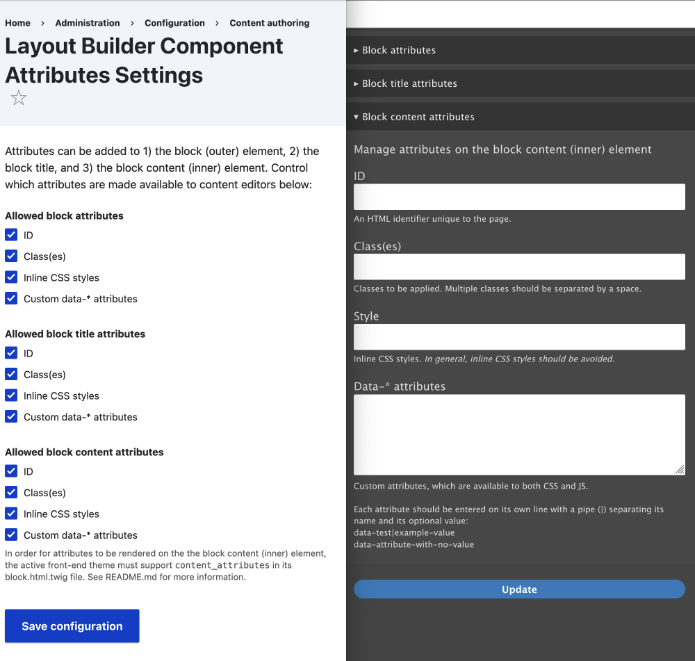
Personally, I only use this module to allow IDs on the block. IDs are useful for navigating to the blocks using URL fragments. That is #contact fragment of the URL https://annupurichalet.com/#contact will take you to the contact ID on the page. On that same page, you will also see the About menu link #about is also a fragment. Both are adding using the Layout Builder Component Attributes module.
URL fragments
"The fragment of a URI is the last part of the URI, starting with the
#character."https://developer.mozilla.org/en-US/docs/Web/URI/Fragment
Another example of this is the link in the following paragraph, where you are taken to the Using Custom Data Attributes heading provide by the table of contents or toc. The TOC added the
#toc-using-custom-data-attributesfragment to the URL .
In the future, I may enable it for Data-* attributes so you can add animations to blocks. I discussed this briefly in the Layout Custom Section Classes & Attributes article. Enabling animations for individual blocks could be useful in some circumstances. It would need to be well documented, however, to make sure page builders know how things work.
As with sections and regions, allowing classes and inline styles to be added doesn't really make sense. Classes would need rules to make them work, and inline styles would allow page builders too much control. Providing set classes is a better option, as you will see in the next module we look at.
That's it for the Layout Builder Component Attributes Module; let's have a look at the Layout Builder Styles module now.
Layout Builder Styles
https://www.drupal.org/project/layout_builder_styles
With Layout Builder Styles, you can:
- Add a style (a class) to blocks and also sections.
- You can put the styles into groups.
- Restricting Styles for Blocks and Sections
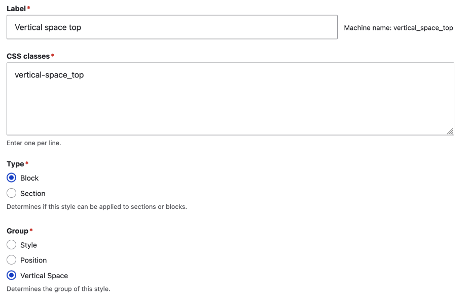
In the front-end UI that the page builder or content creator uses, the groups are really useful for guidance on what the style is used for. This leads to a better user experience.
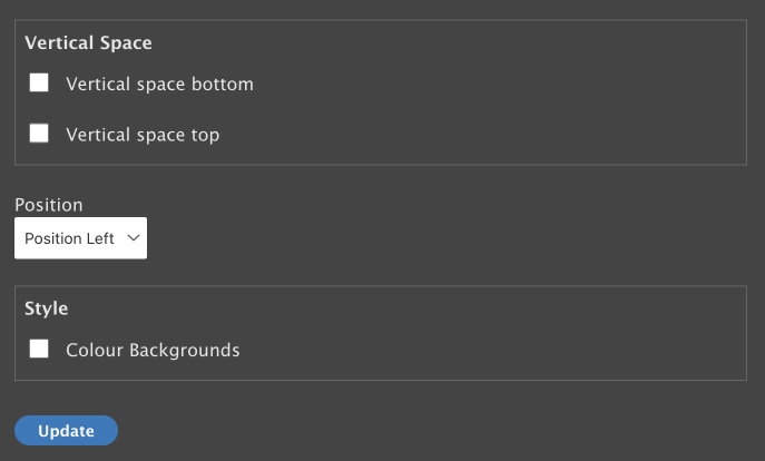
Restricting Styles for Block and Sections
Block Restrictions
For Styles added to a block, you can restrict which blocks the style can be added to. This allows for fine-controlled settings, however, it might take a bit of work to get them right.
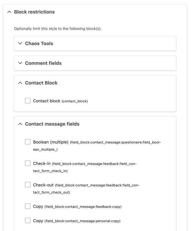
Section Restrictions
For styles added to sections, you can restrict them to which ever layouts your theme has.
This ability to restrict which layouts styles can be used on and the ability to group styles might be a reason to use this module instead of Layout Custom Section Classes & Attributes discussed in part one.
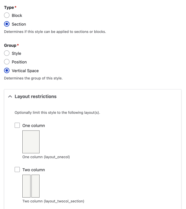
Summary of Layout Builder Styles
This module is powerful, however, you'll still need to add the style rules to your theme, and as I am always advocating for, you will need to have a style guide and user manual so page builders/content creators can use the styles effectively.
Summary
In this article, we looked at two modules, namely the Layout Builder Component Attributes Module and the Layout Builder Styles module, that add the ability to set attributes on a component from in the Layout Builder UI.
We discussed why being able to any class or attribute you want, as you can with the Layout Builder Component Attributes Module, doesn't really make sense; you need to also have a CSS rule that knows what the class or attribute is for. For this reason, the Layout Builder Component Attributes Module is limited in its uses and possibly more for advanced site builders than content creators and or page builders.
On the other hand, we found that the Layout Builder Styles module is much more powerful to restrict what classes can be added to components (and also sections), and that the module allows for fine-control setting of styles.
That's it for allowing basic styling of Layout Builder Component. For a lot of sites and use cases, this will be enough. However, we will keep discovering what other more advanced styling modules can be used in the next series, coming soon.
I hope you found this useful and interesting. If you want to discover more about Drupal, be sure to sign up below for my weekly newsletter. A newsletter about front-end development and design using Drupal and other modern technologies.
Seize the day!