What you will learn
- What modules you can use to provide styling for Layout Builder.
- Design system theory.
- How to modify a template.
This section focuses on giving content creators the ability to style the output of Layout Builder. It starts with looking at how to set classes on the sections, then regions, and then components. I also look at some modules that you can use to add background images.
All the modules I have tested and currently use on my site. In the articles, I describe what each module can do and then also add some subjective comment. I do this because I feel without a rigid set-up it is hard to create something amazing; you need to set limitations in the way of a design system, especially if non-developers and designers are to enjoy using it.
Modify a Layout Builder Template in a Custom Theme
Also note that I am using one default layout template and one slightly modified template that comes with Drupal Layout Builder. These are listed below:
- The one column layout that is not modified. It is the Stable 9 theme template, since the theme is Starterkit based.
- A two column layout that is modified. I have added an extra inner div. This is used to add an optional container class to set the max-width when the class is added. This is so I can have the section 100% width with a background image and the content in a container that is centred.
To modify a layout builder template, you can use the
libraries-overidekey in yourmy-theme.info.ymllibraries-override: layout_builder/twocol_section: easytheme9/layout_builder_twocol_sectionThen all you need to do is copy the code from the base theme directory to your theme directory and modify it how you like.
If you intend on modiying the CSS you will also need to add the reference to your
my-theme.libraries.ymlfile.layout_builder_twocol_section: version: VERSION css: layout: layouts/layout_builder/twocol_section/twocol_section.css: {}
For a refresher on Layouts, please check the getting started with Layout Builder article and also layout builder restrictions.
Okay, now we are ready; let's get stuck in with the first module that allows you to add attributes to the sections and also the regions.
Layout Custom Section Classes Module
https://www.drupal.org/project/layout_custom_section_classes
This module allows you to add classes, IDs, custom classes, inline styles, and custom data-* attributes to sections and regions. The section wrapper, the first div with attributes, and the region wrapper, the dev with region_attributes are seen in the following image.
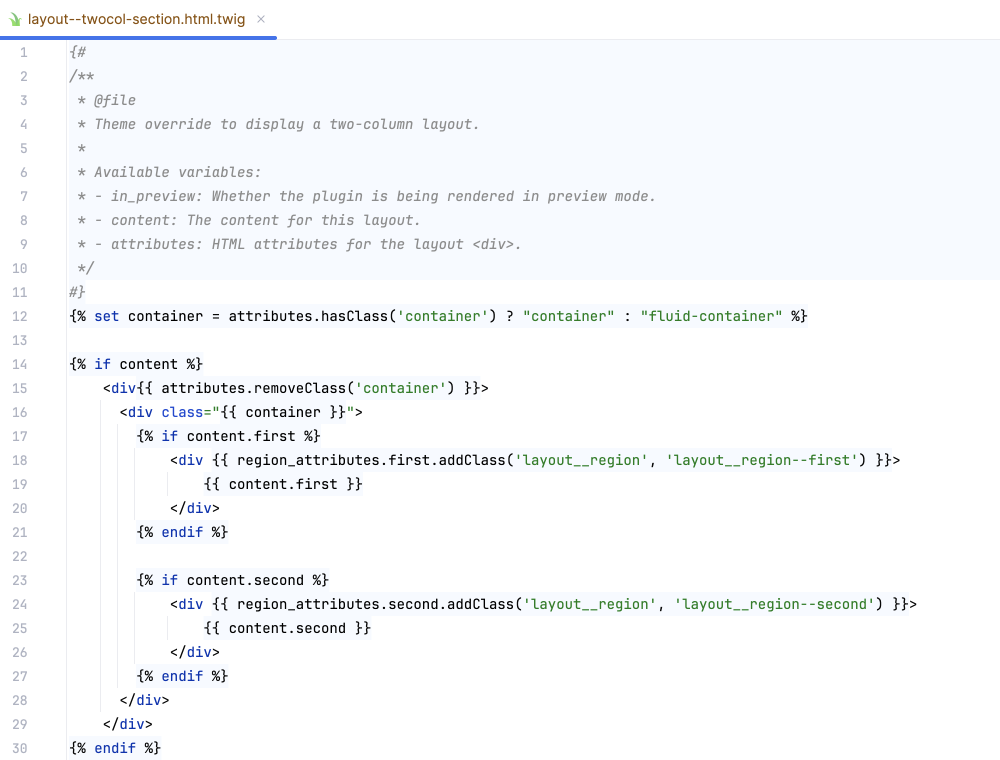
The Layout Custom Section Classes module installs like any module. Please check how to install Drupal modules if you are unfamiliar with that. Once installed, it is time to configure the module.
Installing the Layout Custom Section Classes Module
Once installed, you can restrict users permissions. Permissions available are:
- Administering settings.
- Use the attributes for section and regions.
Let's start but looking the settings.
Set Up Layout Custom Section Classes & Attributes
To use the module:
- Visit the Layout Custom Section Classes Settings page:
Manage > Configuration > Content authoring > Layout Custom Section Classes Settings
/admin/config/content/layout-builder-section-attributes
-
Check which attributes are available to editors using Layout Builder in sections and regions. You can choose from:
- ID's
- Class list
- Classes (Custom)
- Inline styles
- Custom data-* attributes
Image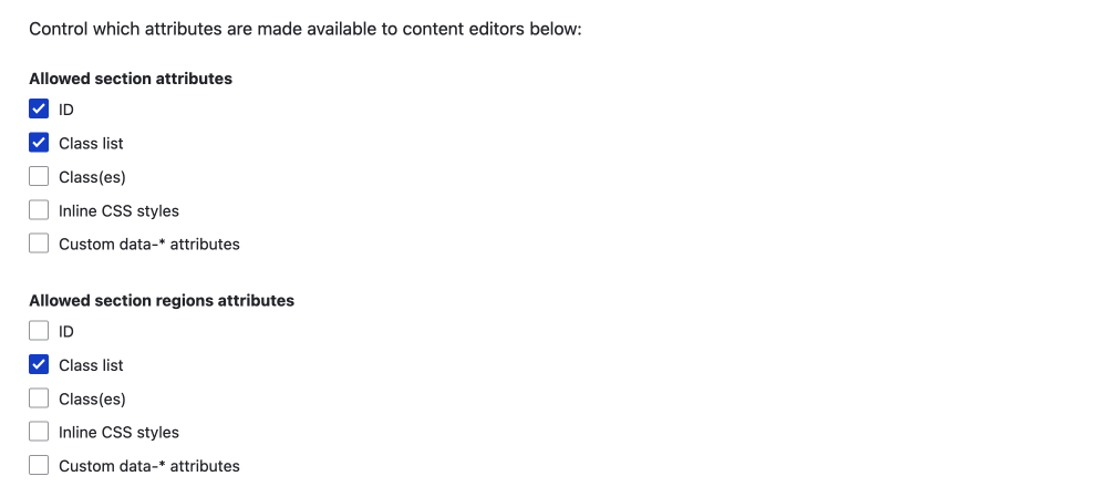
-
Then you can add what CSS classes are available in the class list option in the text area.
You can addclass-name|Friendlynamekey|valuepair if you like. I suggest you do this as the class name may not always be clear to a content creator.
Image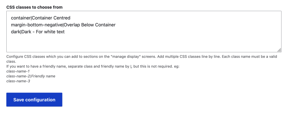
That's it. Now, when you visit the layout page to edit your page, and you configure a section, you will be able to add whichever attributes you have enabled.
Using the Layout Custom Section Classes & Attributes
Now visit a page that uses Layout Builder.
- Click on Configure NAMED Section
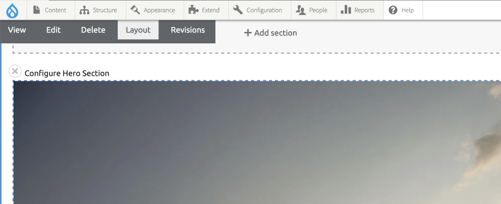
-
The fields are added to the configure Section slide out.
Image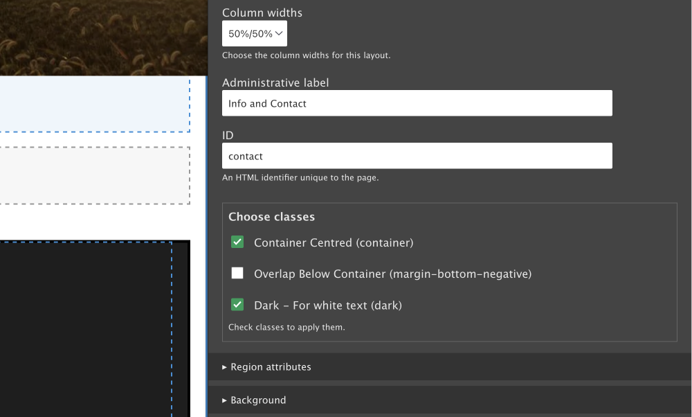
-
Each region/column in a section gets its own settings.
Image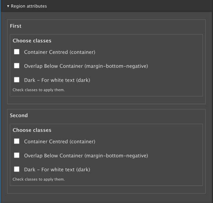
The set-up I am using keeps things to a minimum. This is because the theme needs to provide the CSS to make the attributes work. Thus, no need to allow adding random classes; only what is needed. Following is what I have added.
ID
I have enabled the ID so you can add an ID for navigation to a section.
Class list
I have three classes now, which are listed below.
- Centred Container (container)
- Overlap Below Container (margin-bottom-negative)
- Dark - For white text (dark)
As I build out the theme, I may add more, but only if they are one hundred per cent necessary. With smart CSS and using modern selectors, pseudo-elements, and pseudo-classes, a lot of the styling and layout rules can be added directly to a component's CSS rules.
For example, the overlap below the container class above could be added directly to the Hero component and then the use :has() pseudo-class. Since the :has() pseudo-class is 93.43% supported, this probably is a better solution.
Using Custom data-* attributes
I haven't enabled the usage of data-* attributes, but I will mention that data attributes could be used for adding animations using a library such as AOS(https://michalsnik.github.io/aos/)
You would also need to add the library to your theme for this work.
Add Attributes to Regions
For regions, I haven't set anything up, but this will change as I build out the site. One issue with the regions is the class list is the same, which is a little simplistic, especially since you will only want to add high-level rules to the section as discussed above.
Luckily, there is a branch that has a separate class list for region attributes. I have tested the branch and it works well. If you want more information, please check the Add Classes to Regions in Drupal Layout Builder article.
Summary of Styling Layout Builder Sections
That's it for this module. We have looked at how to use the Layout Custom Section Classes & Attributes from a technical perspective and then also from a user perspective; where providing less choice is actually more. In the case of the site I am building, I only need to provide a container class to constrain the inner div's width and an option to toggle a dark theme for sections.
I hope you found this useful. I will cover how to add image backgrounds in another article soon, and you find out how to add classes and attributes to a component, that is, the separate blocks you use to create your page in the Styling Layout Builder Component article.
Sign up below for a dev and design newsletter if you enjoyed this article. Thanks for reading.