All themes that come with a Drupal 9 site are mobile and desktop-ready using modern responsive website standards. So if you go with some basic overrides of either Bartik (deprecated in Drupal 9.5.0) or Olivero your site will be mobile and desktop ready from day one.
If you decide to build out your own custom front-end then you will need to include responsive web design in your design brief but this would be the same with any theme development. These days a theme should be built mobile-first and responsive from the get-go and thus should not really be seen as an option but as a standard feature.
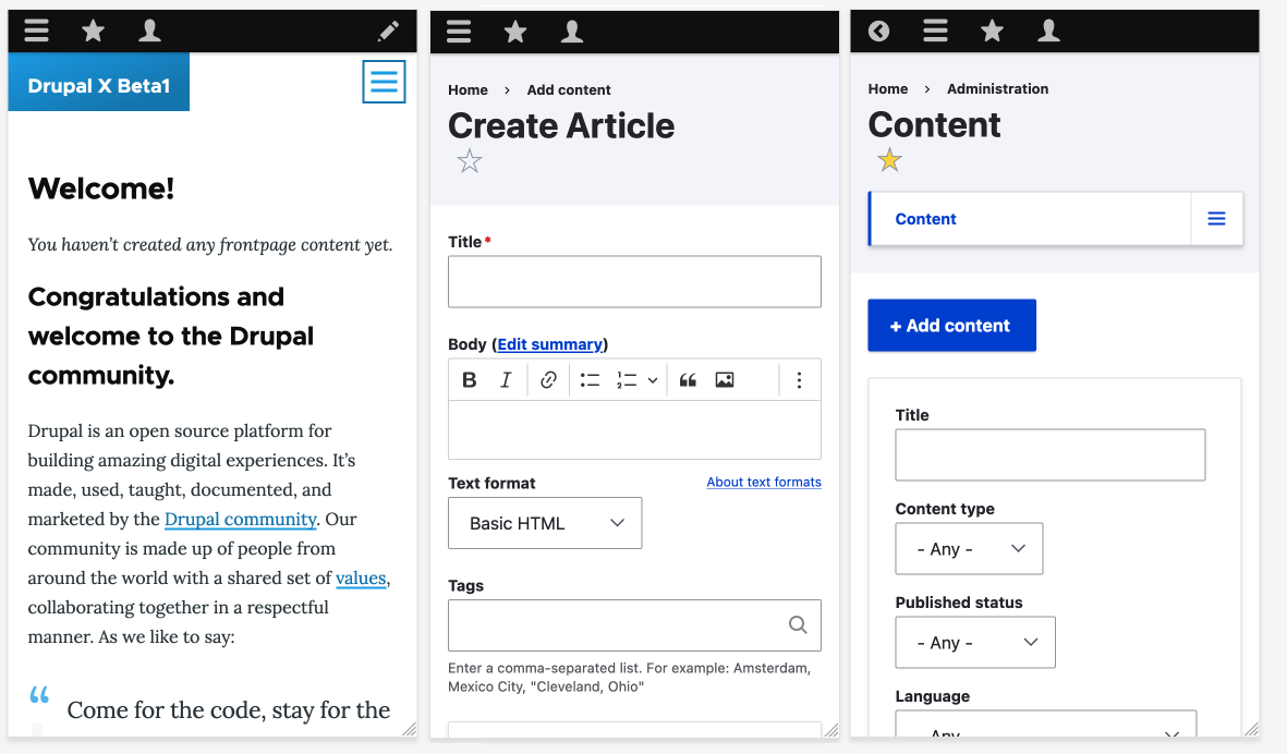
For the admin sections of Drupal, one of the default backend themes will work perfectly to get started, meaning you can use your mobile phone to manage and publish content.
Drupal also has a mighty responsive image system built-in ready to be used, that enables different size images to be served for different device sizes that should be mentioned here. However, I will cover it in more detail in the next section.