As mentioned in the previous article, The Audit and Classification Process, in this article we are going to look at how components are built for a single page website builder.
This article is the longest in the series and took a while to put together. That is because building components is an important part of any website, but hopefully after reading this you will have a good idea of how components can be built for a single page starter website or a landing page builder to use with Drupal.
Types of Components
In doing this audit, I have found two broad types of components; I am going to name them templates or dynamic and define them as follows:
Template Component
These allow for the data to be added and updated using the component edit form.
I have found you can update the data of a template component one of three ways:
- Inline using the configure contextual link.
- In the block library.
- On the node edit form1.
1The node edit form
Please note: I have since moved away from using node edit form components. Since this was due to writing this article, I feel I need to leave the reference here, even though I now prefer using blocks only. That said I do discuss scenarios that using the node edit form method is valid later in this series.
To build template components, the Paragraphs Module is a great solution; if you want structured content with variations of allowed fields; a kind of pick and choose of fields on the fly or repeating field groups. However, a lot of the time, block types with fields might be enough.
Related: Using Paragraphs Module
Dynamic Component
These are Views based components, and to add records to them, you need to add a relevant piece of content. These can be set up with taxonomy fields or other reference field values to include or exclude content from the component.
An example of this is an articles component where all frontpage content is shown or all content in a category.
These can be set up one of two ways:
- Using block display list views.
- Add a view to a block using the views reference field.
- You may want to add a list view to a block so you can add an extra editable field to the component.
Related: Understanding Drupal Views
How to Build Component Types
To build new component types, be they template or dynamic, you need to have site builder skills and permissions.
For this reason, building new component types is something that needs to be thought out when creating a new site so that there is a library of component types. The idea is to build all the types of components that will be needed in advance so they can be easily used.
That said, you can always add a new component type at any time. I am going to cover building components types again after looking at the components I have so far. So for now let's have a look at the components available and their basic set up.
Table of Components Types Built Thus Far
Following are some tables showing the components I have so far. Some of these are left over from the SPA page built using the Paragraphs module (Drupal 7, circa 2018), as discussed in the article using the Paragraphs module linked above. I am including them here as I think they will be useful to have in a final template and site starter.
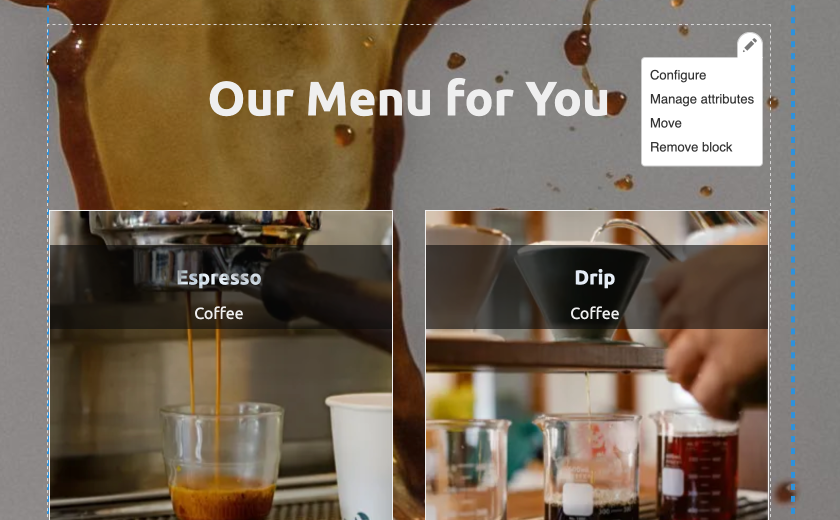
Most of the component types can be seen on the example single pages websites:
https://designkojo.com/demos/drupal/web/tanuki-cave
https://designkojo.com/demos/drupal/web/coffee-love
Non-reusable and Reusable Component Instances
The components that are marked non-reusable are referring to the populated component instances added by a content creator, which we cover in the next section. All component types, be they template or dynamic, can be used unlimited times.
However, I think it is important to distinguish the difference in this build section so we can provide the best components and user experience.
- Non-reusable component instances are added/created within the layout Builder UI or on the node edit form.
- Node edit from components, which I suggest you don't use for this type of site, can be used more than once, but only on the node/page they are created I.e. They can't be used site-wide on other pages.
- Reusable component instances are created and edited via the blocks content page and added in layout builder UI.
The reusable column is marked NR or R, non-reusable and reusable respectively.
The * column helps us see the core method of how they are built and thus how they are used, where the following key is used:
B = Block type
P = Paragraph Type
We only have two main way to build components, that is using a block type or a paragraph type. We can set them up to be used on the node edit form, so I have also added the N to the key.
N = Node edit form
Combinations of PB and PN mean: a paragraph type attached to a block type (PB), and paragraph type attached to a node (the node edit form)(PN).
The main takeaway here is: That when I first started using Layout Builder, I was using paragraphs added using the node edit form (PN); meaning most paragraphs component instances being non-reusable. This was possibly because I took the path from using Paragraphs module to using Layout Builder to lay out pages, but as we see later there is a better way when building site like the demos I shared above.
Non-reusable Components
All these are paragraph types attached to the node edit form.
| Component | Type | How it is Built | reusable | * | P |
|---|---|---|---|---|---|
| Numbers (Statistic Panel) | Template | Paragraph Type Via Edit form | NR | PN | 2 |
| Formatted Text (Choose Format) | Template | Paragraph Type Via Edit form | NR | PN | 3 |
| Hero | Template | Paragraph Type Via Edit form | NR | PN | 4 |
| Map | Template | Paragraph Type Via Edit form | NR | PN | 5 |
| Slider (Gallery) | Template | Paragraph Type Via Edit form | NR | PN | 6 |
| Reviews | Template | Paragraph Type Via Edit form | NR | PN | 7 |
Mixed Reusable & Non-Reusable Components
You will see here that the most versatile components are built using custom blocks; they are both reusable & non-Reusable.
I have added the Content Highlight/ Recommendation List component twice here, even though the second version if non-reusable and should be in the above group. I have done this so you can see that one version is a paragraph added to a custom block (PB) and the other is a paragraph added to the node edit form (PN). Other than that, they are effectively the same.
| Component | Type | How it is Built | reusable | * | P |
|---|---|---|---|---|---|
| Formatted Text (Choose Format) | Template | Block Type (default basic block) | R/ NR | B | |
| Heading | Template | Block Type | R/ NR | B | |
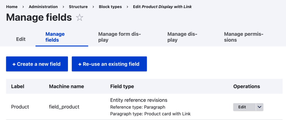
| Content Highlight/ Recommendation List | Template | Paragraph Type Via Block Type | R/ NR | PB | 1 |
| Paragraph Type Via Edit form - This is the same paragraph type attached to a block or node. |
NR | PN | 1 |
Reusable Components
| Component | Type | How it is Built | reusable | * | P |
|---|---|---|---|---|---|
| Team Component | Dynamic | Lists (View) | R | B | |
| Articles/blog component (frontpage Content Block) | Dynamic | Lists (View) | R | B |
For those unfamiliar with Views and Drupal, View block displays or lists (View) are available as a block. The block is not a custom block type and you need to edit the block in the View UI.
Form Components
In the below table, I have documented the forms. I have done this separately because they don't fit neatly into the above classifications. They are built with the contact module that ships with Drupal core, and there are a few oddities that I want to highlight in the audits.
In time, I will look at using Webform and also Commerce to create ways of contacting, surveying, and selling products, but for now, these contact booking forms provide a simple way to send a message to the site owner.
| Component | Type | How it is Built | reusable | * | P |
|---|---|---|---|---|---|
| Booking form | Dynamic | There are multiple variations on this with their own pros and cons. I have split this into two lines to distinguish between B/PB and PN. | |||
| Used as a global block, you can limit forms by using a role or by using the slightly hacky view block region set up in a custom block. 1 | R | B PB | 8 | ||
| The Paragraph Type is created using the hacky view block region and views reference. 1 | NR | PN | 8 | ||
| Booking from with Image | Template | This was built to mimic a product add to cart component. You could add a form and image separately in a two column section. This may be removed in favour of a product from commerce at (non-reusable). | NR | PN | 9 |
1Related: Creating a Contact Form for Layout Builder (Customizing Drupal Paragraphs Module by Extending Paragraph Types)
Summary of Audit Tables
As we can see, the components have been built in many ways; from using basic fields, paragraphs types, fields added by using modules (i.e. Maps, sliders), and Views. However, as stated we really only have two main way to assemble the fields or collection of fields, and that is by using a block type or a paragraph type.
Some notes and observations
- Fully non-reusable components are components built using paragraph types and added via node edit form.
- The Content Highlight component was the first component that used paragraphs added to a custom block type. And therefore it is marked PB and PN.
- All dynamic components are reusable by the way they are generated. I.e. you can use on any of the pages/layouts that have permissions to place them.
In all, we have 9 Paragraph Types components, as we can see using the P column and also indicated with a P in the * column, and 6 block types.
Building New Component Types
To add new template components, you need to be familiar with adding different entity types, that is, how you can attach fields to entities and how some entity types allow for greater flexibility. We also have lists that are dynamic, which are generally built using the Views module, Drupal's powerful SQL builder.
Even though it is beyond the scope of this article, I am going to touch on the basics here, and then follow up with a few components that could be good to add before moving on to how the components can be used; that is create instances of the components and add them to a layout.
Building Template Components
At a simple level, we have custom block types and paragraphs types to build pretty much any template component you need.
The main difference being, Paragraphs allows you to build components that allow various blocks of recurring content, as with custom blocks are more rigid.
Also note that custom blocks are the way you add all components to Layout Builder, regardless of how you build them.
Custom Blocks and Paragraphs
To use paragraphs based components, you need to attach your paragraph types to a custom block type, either using a module such as the Paragraph Blocks module or using a paragraphs reference field in a block type. There is also the Paragraph block module (yes, singular block). I have tested the Paragraph Block module, but it has some limitations at present so lets keep to the two tried and test methods I have written about and linked below.
Using Paragraphs Blocks to Add Paragraph Types to Layout Builder
A valid way, but requires a 2 step process. I discuss at the end when this might be a good way. By the audit tables we have just looked at, you can see this is the main way I added paragraphs to use with Layout Builder, but as I worked through this audit discovered the next method is better.
Add Paragraph Types to Custom Blocks to Use in Layout Builder
Recommended way for single web page designs.
Advanced Paragraphs module techniques, such as nested Paragraphs, can bring even more flexibility to your components. Nesting paragraph types can allow for more variation on data types that can be entered into a component when an instance is created. This is beyond the scope of this article however, so let take a quick look at Dynamic components are built.
Dynamic Components
To build components that are dynamic, you require knowledge of the Views module. At its most simplest, you can copy pre-existing views and modify them, and with advanced knowledge of SQL the sky is the limit. If you are unfamiliar with Views, I suggest you read Views module; the Drupal SQL view builder.
Even though you can build views all in the UI, you'll still need some basic understanding of how relationships work to filter your data to what is needed and build truly dynamic components.
I mention this is so we can see that building components isn't something that a content creator can do easily and needs to be considered when designing and developing a site and components for end users; this may change with AI, however that's a story for another day.
Some Components that could be good to Build
Below are some ideas for some components that I feel are missing and could be useful:
| Component | Type | How to Build |
|---|---|---|
| Photo Text Left Right Alternating | Template | Paragraphs |
| More Gallery Options | Template | Fields |
| Video Background | Template | Fields |
| Team | Template | Paragraphs |
| Reviews | Dynamic | List (views) |
Some of these could be new option settings added to current components, and some could be new components but made more general so they can be used for different use-cases.
For now, I hope you get the idea; auditing what we have can show that there might be missing functionality.
Ideas for more general components could be renaming the component to make it sound more versatile or adding features to template components that can be enabled through a checkbox.
Building Components is a Specialized Job
One last point about building new components is that it is more than likely that you'll need to modify or add styling rules to the theme to get them to look right, and for this reason, creating new components isn't something all content creators will be able to do. Never fair, however, with a well designed theme, like what we are building currently, most users won't need to build new types of components.
So we have Components, what now?
Once we have our component types, we can then use them on our site, and to do this, we need to create instances of our components. When I talk about component instances, I refer to the individual populated components. Let's look at how we can create some instances to use on our site.
After creating the leading tables, I also thought it might be good to visualize how the components can be used or added to a layout. I did this as it is possible to add components and populate components in various ways. We will look at this in the following section, Create: How Component instances can be created or edited.
This article is part of a series on auditing a site I have built using Drupal and Layout Builder. It is though breaking down the full process that is has allowed me to build a better page builder. I intend to follow up with a series on using Canvas, the new Drupal page builder, using what we have discussed here as a basis so we can compare when Canvas might be a better solution; in time I think Canvas will replace Layout Builder, but in saying that I feel Layout Builder still has some legs left.
Thanks for reading and follow the link below to the next part.